Actually, it's not the first thing we've done as we've set about planting Eatons Hill Presbyterian Church - we've recruited a core group, we've run trial services, we've chosen a venue. It's only now, as we start working on publicity, that we need to decide on a 'corporate style' that will identify our new congregation. So, here's the first contender. Today we invested $39 in buying Halvorsen and Halvorsen Extra Bold from the Australian Type Foundry. (That's a 50% discount. If you want to know how we got it, leave a comment and I'll tell you the story.)
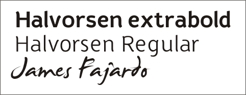
We haven't totally committed to Halvorsen yet - but if we do, the overall effect will be something like this:

Please let us know what you think.
2 comments:
Hmmm...My initial thought is perhaps its a bit heavy... and too square - after your 'fresh & modern' looking orange logo thingy, this one is maybe a little too heavy & boxy and makes it almost a bit dated looking? maybe trying to put the "presbyterian church" in a lighter (and possibly different) font might solve the problem. having it in capitals i think works well. i like the "eaton hills" font. I'll send you some variations so you know what I mean. that's just my 2 cents worth.
But Sarah, going to a lighter font is going to break our corporate font rule! Thanks for the alternatives though.
Post a Comment