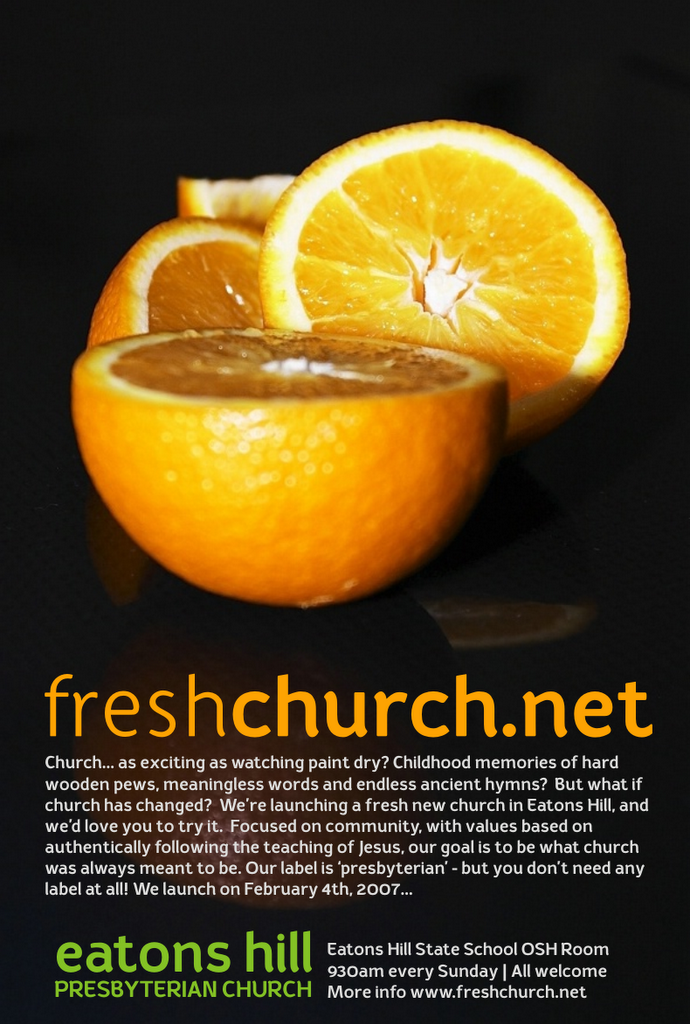
A draft poster for the Freshchurch launch campaign. Does the black background work for you? Does it need to follow the orange on white theme of the previous post?
Let's get it clear right from the start. Beauty really is only skin deep. But that doesn't mean we should go out of our way to make church publications look intentionally ugly or amateurish. The cool thing is, when you do it yourself, a delicious design costs no more than a design disaster. It's all about attention to detail; a statement that what you're doing and saying is worth doing and saying well.
4 comments:
I reckon the black works - black and orange is quite stricking. If the background was white the poster would look quite washed out and uninspiring.
Just a question about the words though - why have you chosen to invite people to "try" your church (rather than maybe "meet" or "join with")?
Linda - all good points! The website is just a placeholder - we're getting Paul Harvey (www.harveybros.com) to do something really nice for us. AND, we'll be working hard to make church FRESH in reality. Interesting - if you take a look at www.latechurch.com, people who come along have actually commented that the website gives a good indication of the reality.
Like the black one. More stylish, I reckon, than the white! Good work.
That brand is a bottler!
Post a Comment