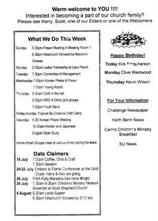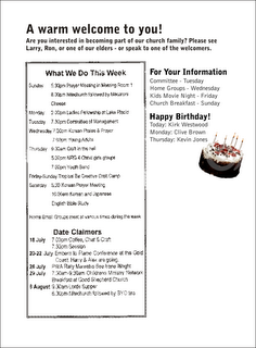
While we're at it, let's left-align the associated text. We'll change the positions of the two blocks of information, and put birthdays at the bottom so the new photo-object cake can hang underneath. (It's from dreamstime.com). I've changed fonts, and chosen to use Bell Gothic and Bell Gothic Black to give contrast. It's going to look better to left-align the title text as well; and of course, replace the fonts. Next will come the central text box... (Click images for a larger view.)

But what are we going to do with the box of oddly aligned text on the left? Should we left-align it? Or maybe right-align it to meet the same visual guide line holding the righthand column of text? Mmm. Suggestions welcome.
No comments:
Post a Comment