Let's start with a college crest. I borrowed the burning bush, cross and stars directly from the traditional Presbyterian Crest. (The bush, by the way, is a beautiful piece of design from a past era. It still looks great!)
Then, why not simplify the name from "Consortium of Reformed Colleges" to "Queensland Theological College", or QTC. Here are some early results:
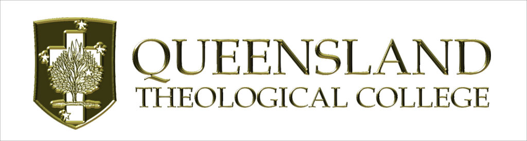
In an attempt to add just a little bit of interest to the abbreviated version, I've extended the understroke on the Q to bring it almost across to the T. I guess it would be wise to do the same thing on the full-text version. As usual, comments are welcome.

A NOTE TO THOSE COMMENTING ON COLOURS: Please ignore the background colour, the gold-embossed rendering etc. These are just examples; the logo will appear in many different situations. I should have just shown it as a black image on white, but that's not nearly as much fun to look at.
5 comments:
I really like the logo idea - very regal looking in gold!
And you're right about the need for a name change. No-one that I know calls it by either of its proper names and most people struggle even to say "consortium", let along spell it!
Great typography and logo, but lighten that black to improve visibility
Hangon - the background is now purple. Was that always the case? The purple background makes the logo very difficult to read and look at.
Oops. I'll replace the purple... at least in one of them.
Post a Comment