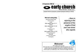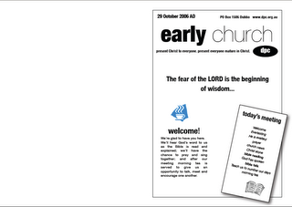

I tried to give a better line of sight for the page and increase the amount of white. I streamlined the fonts I used even further plus I wanted to make the "verse of the day" more the centre piece of the page (so as to show that the bible is at the heart of what we're on about.)
I think it can still be improved a lot and so (if it's not too embarrassingly poor) if you'd like to post it and get comments that might be fun. Some of my limitations though are that we have a very average copier and so any cool grey scale/ colour graphics just lose all effect."
As Bryson says, comments are welcome. I'll start with a couple. I like the re-working of the 'early church' banner with the contrasting fonts - due to the font contrast, you can actually run the two words together without a space, as in 'earlychurch' - and it may look better. The space interrupts the kick you get out of the contrast between the fonts. Regarding the font contrast, I'm assuming you've used Helvetica Neue black and light as the contrasting pair? I wonder if you'd be better off toning it down just a little; the black version of the font has distinctly different letter shapes to the light; is there a weight that keeps the same roundness in the characters, while still offering a strong contrast?
1 comment:
One other comment - time for a new copier! We found that leasing a digital printer/copier was no more expensive than maintaining our old copier. In fact, stepping up to a colour digital machine - which can either be used as a copier or run direct from the computer, wasn't much more either. We've got a Toshiba.
Post a Comment