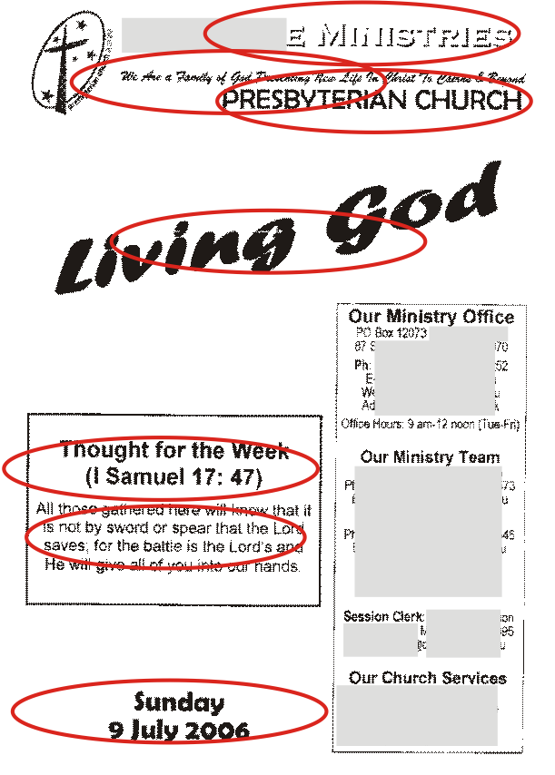
Here's a church bulletin sheet I picked up recently. It's a useful starting point for a design makeover. First, count the number of different fonts that appear on the front page...

Try setting up a similar document in your own design software; start with mutliple fonts, and try to reduce it to a maximum of two contrasting faces.
3 comments:
I think the worst font-crime in this example is the use of Berlin Sans along with Arial... a classic case of two similar sans-serif fonts clashing because they're almost the same.
For a moment there I was wondering who this New Life Ministries Presbyterian Church is? I was hoping it wasn't us...
ha
I have to tell you, the service sheet you've used in your example is one of that particular church's better ones. I visit that church most holidays (just last weekend infact) and it is definately one of their 'less cluttered' ones, sadly enough. I know, the thought makes me cringe aswell. Don't worry I've got plenty of other samples if you ever need any more.
Post a Comment