"The secret of successful combination of typefaces seems to be the ability to maintain several contrasts between them. Look for at least two contrasts when selecting your 'worker' and 'special' faces. The stronger the contrast, the more effective the combination will be. You can contrast:
* their form: serif (like Times, with little tags on the stems), sans serif (like Arial, without tags), script or decorative
* their weight
* their scale
* their spacing (wide or narrow)
* their slant (Roman or italic)
* their shape (condensed or normal)
* their case (upper or lower)
Whatever you do, avoid using two different sans serif fonts on a page. For example, don't use both Eras and Arial - they look similar, but the small differences clash disasterously.
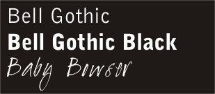
At MPC, it was time to supplement our "house style" with a contrasting "special" font. I found "Baby Bowser" at www.dafont.com ... and I think it works superbly with the Bell Gothic family. Leave your comments and tell me what you think.
No comments:
Post a Comment