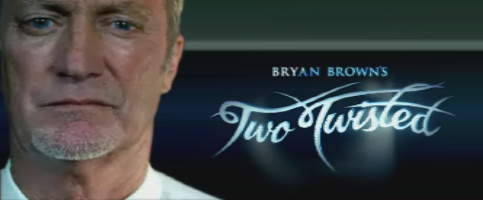
Here's an example. Though I've only seen one episode, the logo for Bryan Brown's 'Two Twisted' series on channel 9 really caught my eye. It's sensational:
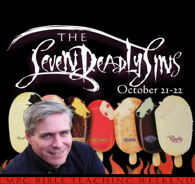
With a teaching weekend on "The Seven Deadly Sins" coming up, I figured that the topic had suitable 'dark edge' for a similar treatment. I experimented with a bit of amateur calligraphy of my own before settling on the font LMS Bloody Brujah on www.dafont.com. I added a few swishes and swirls, and ended up with something that I thought was sufficiently evil looking... so much so that I had to lighten the effect with a few "Seven Deadly Sins" Ice Creams from Streets. Comments and suggestions welcome:
1 comment:
Making your speaker look like a SINister Minister also helps with the overall look
Post a Comment