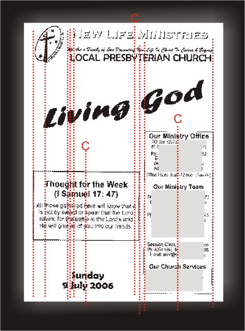
David Whitbread puts it this way: "One way to ease the resulting angst is to limit the number of implied lines and shapes by using the same ones many times, instead of creating new ones at each introduction of a new element. This strengthens the layout. The secret formula to succesful laout... is to limit the number of vertical and horizontal divisions of the space. Let the same line do a few jobs. It could be:
* the edge of the title block
* the border of a picture
* the centre of a logo at the bottom of a page.
Aligning elements effectively groups them together, and creates a single entity in your design. You'll need to be aware of how these visually grouped elements work with the other parts of your design in terms of balance and contrast.
In our makeover example, notice how many different "lines" there are on the page. How could you reduce them?
No comments:
Post a Comment