
Showing posts with label fonts. Show all posts
Showing posts with label fonts. Show all posts
Thursday, April 02, 2009
Font resources
Tuesday, February 27, 2007
Two neat new free fonts
Free fonts are a dime a dozen - it's only rarely that you'll find a gem that's well enough designed for professional use. Here are two I've unearthed recently at www.dafont.com... they may even work quite well as partners, with Yanone as headline font and Fontin for body text.


Saturday, November 04, 2006
What the... font?
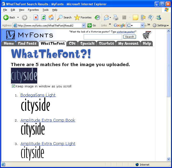
As a follow on to recent font hunting requests, there's a useful service from Myfonts.com called "What the Font..." Just upload an image of the font you want, and they'll do the rest.
Testing with Stuart Atkinson's "cityside" font quest, the site matched the sample correctly with BodegaSans light - agreeing with our expert contributor Dave Cumberbeach.

Testing with Stuart Atkinson's "cityside" font quest, the site matched the sample correctly with BodegaSans light - agreeing with our expert contributor Dave Cumberbeach.
Tuesday, October 10, 2006
Finding a Font
"Can you tell me if there is an easy way to find this font?" asks Stuart Atkinson. "I have looked on dafonts, but could take years...."
At first glance, it looks like Gil Sans MT Extra Condensed Bold. Any other suggestions?

At first glance, it looks like Gil Sans MT Extra Condensed Bold. Any other suggestions?

Thursday, September 21, 2006
Compatible Typefaces
Remember the rule? Too many fonts make your work look like a kid in a toybox. It's important in any publication to stick to no more than a couple of contrasting fonts. And in defining a corporate 'identity', our goal is to lock in one basic type family with multiple weights. Let's bend the rules just a fraction... designer David Whitbread says that some organisations choose a "support" typeface as well. It may add un-necessary complications, and needs care if you're going to handle it with success. The key is... contrast. For typefaces to work together well, they've got to be decidedly different. Here's Whitbread again (p185, The Design Manual):
"The secret of successful combination of typefaces seems to be the ability to maintain several contrasts between them. Look for at least two contrasts when selecting your 'worker' and 'special' faces. The stronger the contrast, the more effective the combination will be. You can contrast:
* their form: serif (like Times, with little tags on the stems), sans serif (like Arial, without tags), script or decorative
* their weight
* their scale
* their spacing (wide or narrow)
* their slant (Roman or italic)
* their shape (condensed or normal)
* their case (upper or lower)
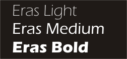
Whatever you do, avoid using two different sans serif fonts on a page. For example, don't use both Eras and Arial - they look similar, but the small differences clash disasterously.
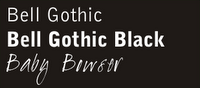
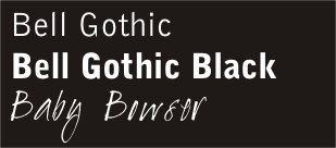
At MPC, it was time to supplement our "house style" with a contrasting "special" font. I found "Baby Bowser" at www.dafont.com ... and I think it works superbly with the Bell Gothic family. Leave your comments and tell me what you think.
"The secret of successful combination of typefaces seems to be the ability to maintain several contrasts between them. Look for at least two contrasts when selecting your 'worker' and 'special' faces. The stronger the contrast, the more effective the combination will be. You can contrast:
* their form: serif (like Times, with little tags on the stems), sans serif (like Arial, without tags), script or decorative
* their weight
* their scale
* their spacing (wide or narrow)
* their slant (Roman or italic)
* their shape (condensed or normal)
* their case (upper or lower)
Whatever you do, avoid using two different sans serif fonts on a page. For example, don't use both Eras and Arial - they look similar, but the small differences clash disasterously.
At MPC, it was time to supplement our "house style" with a contrasting "special" font. I found "Baby Bowser" at www.dafont.com ... and I think it works superbly with the Bell Gothic family. Leave your comments and tell me what you think.
Corporate Print Identity
If you're still not convinced it's worth giving your church publications a makeover, consider this quote from David Whitbread's Design Manual. "Print identity is only part of an organisations image - but it's probably the easiest part to control. Many organisations appear to not understand how their visual identity works for them, or in many cases, against them. The print identity affects not only outsiders' views of an organisation, but also insiders'. It can help the organisation establish a perception of itself as worthwhile, trustworthy, professional, forward thinking, up-to-date... alternatively, it can look fly-by-night, cheap, tasteless or muddled." Naturally, a print-identity makeover won't help a bit if your church really is fly-by-night, cheap, tasteless or muddled. But if you're looking for a way to symbolise the fact that your church is going forward with confidence - much to the current members as to newcomers - you could do worse than professionalise your print-identity.
How? It's simple. Get rid of multiple fonts! Yeah, I know - fonts are fun. I love 'em. But the trick to professionalising your look is to limit your typeface selection to a maximum of two carefully selected fonts. Look around. Phone companies like Telstra and '3'have easily identifiable corporate fonts that appear in every ad. In some cases, the typeface is specially commisioned and designed. To change a corporate typestyle is no small decision - once a 'house style' is defined, it's applied rigorously.
At Mitchelton Presbyterian Church, we used the Eras font family for a number of years. It's great, because it comes in a number of different weights, from Eras Light right through the range to Eras Black and Eras Ultra. We used Eras medium for body text, and picked out strong contrasts with Eras Ultra, or at times, with large headings in Eras Light.
After a few years, it was time for a makeover. Eras was starting to look a bit stodgy and dated. Again, the goal was to find a typeface that contained a broad family of different weights - not so easy if you're on a limited font budget. We settled on the Bell Gothic family. With clean modern lines, it looked fresh, and there's a nice contrast between the medium and black versions.

While - to be honest - I didn't like the Bell Gothic lettershapes as much as Eras, our publications had a clean, fresh look. We used Bell Gothic on our bulletin, Bell Gothic on our newsletters, Bell Gothic on our mail, Bell Gothic on our study guides... it was everywhere.
There's one more step in the process; but that's another story.
Subscribe to:
Posts (Atom)