 "Thought I'd share my design for the upcoming Indonesian Presbyterian Church Xmas Service," says Tommy Wong. Thanks Tommy - nice job.
 Tuesday, December 09, 2008
Christmas Art
 "Thought I'd share my design for the upcoming Indonesian Presbyterian Church Xmas Service," says Tommy Wong. Thanks Tommy - nice job.
 Friday, November 14, 2008
When Rebranding is only Skin Deep
Mike O'Connor pointed me to the excellent new Beyond Relevance blog, which is well worth a look. Here's a snatch from a recent article:
re-Branding on Momentum
It seems like churches these days have seen the power of marketing and branding just enough to jump onto the band wagon. Churches everywhere are sliding onto the re-branding table and looking for a quick-fix for their "growing" concerns. A few recent conversations have illustrated the often missing link in a church's preparedness to go under the knife for a branding make-over.
Now, before I get into this, please note that true "branding" goes much deeper than skin deep. True branding is a plum-line from the core of who you are to the people God has called you to reach. It is a promise you deliver on in all that you do and is seen on the surface as your communication, design, image or brand. With that said...
I was teaching a session on branding last week at the National Youth Workers Convention. I normally speak to senior pastors, so I jumped at the chance to hang out with youth leaders for a few days. It was a blast. I was challenging on the need for churches to become successful without a branding effort and that the best brands are those that learn how to connect to people and grow organically first—and then build their brand around that. A youth leader visited me afterwards almost in tears. He had recently taken a position at a new church and, as what he (and much of the church world) thought was norm, decided to launch a new youth group brand. He built that brand around a new look, new logo, new name, new everything. He developed the image of this great brand before he had built trust in his youth and momentum through his ability to connect with them and see growth. He then attempted to launch the brand with a huge event and watched it all to fall flat. The results were a disappointment for him and now his youth group is struggling and shell-shocked. He was heartbroken.
What this represents is surface re-branding. It is an epidemic. It is the concept that if we are not attracting people, it is because we do not have the right name or image, and therefore, we need to change it and re-design our look. With all the love I can muster, if you are not growing what you have, it is not because of your logo. If you are not connecting with people that come through your doors in a way that causes them to come back and bring others, no amount of design can create a long term fix. If you do have momentum however, the right brand can be a catalyst to new levels of growth.
This stuff is not taught in schools. In February, I sat down with a doctoral student at Dallas Theological Seminary who interviewed me regarding his doctoral thesis on church brand development. His brilliantly written thesis had a fatal flaw—it omitted that re-branding should only take place after momentum has been generated. To simply re-brand a church when it has not found its traction is generally just an indication to your community that you’ve tried everything else without success and in your last attempt, you’re changing your style and/or name in order to reinvent yourself. Branding done right is not a "fix". It is a swagger. It is a well-communicated sense of self built on successfully connecting with others.
Here’s the deal: if you aren’t currently connecting with people right where they’re at, no amount of branding/design can solve your problem. Re-branding without momentum is kind of like dressing up for your prom and forgetting to court a date. Think about it.
Design cannot obtain what a disconnected ministry cannot reach.
© Richard L. Reising
Published on Friday, November 7, 2008 @ 12:00 AM CST
Thursday, November 06, 2008
CREATE Conference Coming Soon
Saturday, November 01, 2008
Mirror, Mirror, on the wall...
Friday, October 31, 2008
Christmas again
 Anyone else got some Christmas designs? It's time to get them to your local printshop! I'll post any ideas you send me.
Thursday, September 18, 2008
Selling Forgiveness
There's been debate among the ministry team at MPC about whether this web-poster is an engaging and attractive way to advertise a teaching weekend on "Forgiveness." It's masculine, it's dark, and it's based on the movie poster from Clint Eastwood's moody movie "Unforgiven." Personally, I figured it had a lot of advantages over a design featuring lots of flowers and girly stuff... but the jury is still out. Comments welcome.
Tuesday, September 16, 2008
How to make an A5 booklet
Saturday, September 13, 2008
Genuine Imitation
If you're looking for a free photoshop clone, read the Lifehacker review here. Otherwise, head straight over the the Artweaver site and download a copy right away. According to Lifehacker, "While it isn't a true replacement for Photoshop, Artweaver's feature set is robust; it includes layer management, image cloning, a history function, transparency, pen tablet support, and a host of the common filters in Photoshop."
Tuesday, September 09, 2008
Design Tips for Text
2. Supersize it
3. Create a time and place
4. Amaze with initials
5. Make your own alphabet
6. Have some pun to make your point
7. Do the unexpected
8. Make white space your friend
9. Use both sets of letters
10. Play with punctuation
Friday, July 11, 2008
Multicolr Search Lab Sorts Flickr Pictures by Colour | Lifehacker Australia

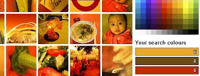
Lifehacker Australia usefully reports that "Multicolr Search Lab Sorts Flickr Pictures by Colour.
Need an image with dark blue and green undertones for desktop wallpaper or a design project? Multicolr Search Lab, a free search utility, digs through roughly 3 million images in Flickr's 'Interesting' set for photos featuring the colours you select. You can make one colour more prominent by selecting it multiple times, and the results seem pretty genuine—though you have to find the colours with your eyes, and can't put in hexadecimal or RGB values grabbed from graphics programs. The colour search engine also has a front end for Alamy Stock Photography for those in need of definite royalty-free images."
Tuesday, June 24, 2008
I Am Red, Hear Me Roar - Chris Dickman
Saturday, June 21, 2008
Presentation Masterclass
Friday, June 20, 2008
Annual Australasian Christian Conference

Cambridge University Style Guide
Wednesday, May 21, 2008
Vectors Explained by Mike Pittman
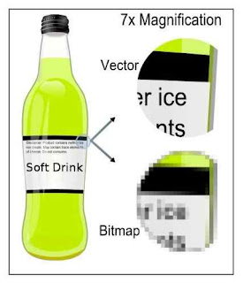
 You don't have to go far on this site to hear about 'vector' graphics - but what are they? Well, 'vector' graphics are made of smooth curves, as opposed to the dots or pixels that make up 'bitmap' graphics. A bitmap image will get chunky or 'pixelated' when you enlarge it, but the curves in a vector image will stay smooth.
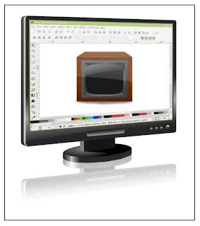
The format they use is called SVG, which stands for Scalable Vector Graphics. SVG files open in Adobe Illustrator, Corel Draw or the free Inkscape. They are also quite easy to modify, because the bits kind of float over the top of each other. So, for instance, click on the text on the soft drink bottle, hit delete, and type something different. Click on the lime colour and change it to strawberry red in one more click. It's easy!

To learn more about vector editing, check out some great video tutorials by Heathenx (don't be turned off by the name). The videos on his home page can be large (~40Mb), but thankfully much smaller versions are up on YouTube here. Heathenx's videos are specific to Inkscape, but the principles transfer to any vector package.
So, watch some videos, have a bit of a muck around, and you'll soon get the hang of it. Remember to save your work, and there's always the undo button if you make a mistake. Mike Pittman, Tuggeranong Presbyterian Church
Thursday, April 17, 2008
The Challenge of Atheism
A Neat technique
 "I noticed this on the Anglican website advertising connect 09," says Stuart Atkinson. "I don’t really know how it’s done but I really like the effect."
Agreed. Well done to Anglican Media's design department. (Sarah, is that you?) Clearly, it's a combination of vector and bitmap artwork, and there's an easy way to get something of the same effect... though not with the neat graduated colours that add depth to the CONNECT 09 piece.
If you want to try an easy simulation though, you can use Corel Draw's image cutout and autotrace functions.
I'm using Corel 14, which although s-l-o-w compared with version 12, offers greatly improved trace features.
Step 1 - Import a photo. The selection of your original photo image will determine the quality of the outcome. The simplicity and colour range of your background will be especially important. This one is a little too complex... but let's run with it.
Step 2 - Choose 'Edit Bitmap' to export the image to Corel Photo Paint. Use the ImageCutout Lab feature to trace around the girl in the foreground. Meanwhile, in Corel Draw, autotrace the original image with settings for low resolution Line Art. You want the resulting image to be as simple as possible.
Step 3 - Assemble

Paste the cutout image of the girl exactly on top of her vectorised representation. You've now got a bitmap foreground overlaid on a simple vectorised background.
 Step 4. Here's the result. I simplified the vector background a little by taking out the background people and extending the areas of green.
Step 5. Finishing Touches - Add some text and compare it with the original image at the top of this post. It's a similar effect, but was completed in minutes...

Saturday, February 02, 2008
A Beautiful Powerpoint


