Sunday, December 31, 2006

Even more bulletin makeover tips...

Sarah van Delden says:

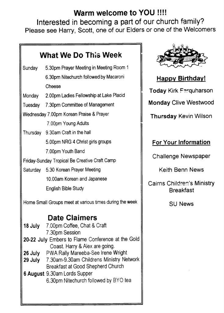
"Hi Phil. I had a look at Bryson's makeover of his bulletin. I'm glad to see people willing to give it a go in giving their service sheets a fresh coat of paint! Definitely an improvement on the whitespace and layout etc of the old one. I've had a go at cleaning up some of the alignment and reworking the layout to see if it can be made slighly more crisp.


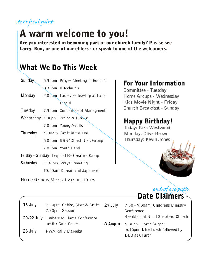
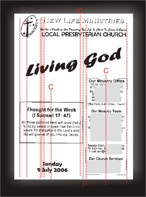
"I've done up two variations, the first of which actually drops the list of things in the actual order of service. If this bulletin is more than just a single page, my recommendation would be to put it inside, allowing the front page to be a little less cluttered. If it is necessary to have it on the front page either keep it small so it doesn't distract, or as Bryson has done, make it unique so there is clearly a reason for it being there. His use of a shadowed box cutting out the side of the page in this case is an example of this.

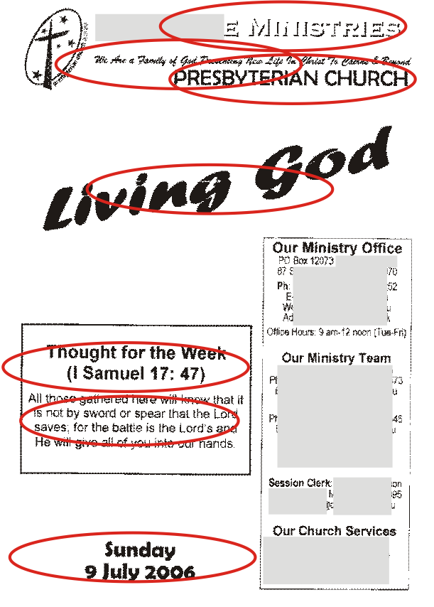
Alignment is the key to success in bulletins. You will see in Bryson's version, there are a number of starting points for both vertical and horizontal alignment. By keeping everything within the bounds of the 'imaginary' box set by the width of the title you can maintain left & right alignment without the need for a physical black outline around the page. The words & whitespace themselves create the illustion of a neatly confined space.

Anyway hopefully these variations & tips will continue to help.

Regards,
Sarah"

Thanks Sarah. Always good to have tips from a pro!


Thursday, November 16, 2006

Quick Advert Make-over


Here's a quick re-work of an ad trying to encourage people to enrol for college courses. The first was produced in Microsoft Publisher; the revised version in Corel Draw. A couple of observations; WordArt is almost never artistic. I think it's best completely avoided. Second, heavy black borders usually don't work too well either. Finally, the whole alignment issue again raises its ugly head. Any thoughts?

Wednesday, November 15, 2006

Freshchurch Finals


Still torn over whether to run with white or black for our Freshchurch ad campaign. (We're launching a new church at Eatons Hill on Brisbane's northside - these are for the letterbox drop.)

Your comments and preferences are welcome.

Friday, November 10, 2006

Beautiful Church Websites

Here's a site worth clicking - ChurchBeauty.com is a gallery of the best church website designs. Classifications include categories like "Well written", "Clean", "Simple" and "Edgy." Thanks to Martin Howard for the tip.

Thursday, November 09, 2006

The Word is worth a thousand pictures...

Here's a conference that's worth investigating. Titled "Promoting the Word Through Image and Text," there's an action packed one-day program planned for November 25th at Ryde Anglican Centre. A large team of industry experts will address issues like effective copywriting, graphic design, video and powerpoint presentations. Sponsored by FEVA, it looks like a great program.

Three from PCPC

Luke Tattersall at Parramatta City Presbyterian Church has come up with three great postcard sized ads for upcoming church events. If only someone would invite me to the Wine Appreciation night...


Saturday, November 04, 2006

Some favourite sites from a design pro...

Graphic designer Martin Howard from Media 7 offers a few favourite links:
Free stock photos
http://www.sxc.hu

Logo inpiration
http://www.misipile.com/

Progressive church web design....
http://www.kcrevolution.org/
http://www.dulleschurch.org/
http://www.discoverthecoast.com/
http://www.journeychurchnashville.com/

I'll add another church site to the list - www.latechurch.com, with design by Paul Harvey.

What the... font?

As a follow on to recent font hunting requests, there's a useful service from Myfonts.com called "What the Font..." Just upload an image of the font you want, and they'll do the rest.

Testing with Stuart Atkinson's "cityside" font quest, the site matched the sample correctly with BodegaSans light - agreeing with our expert contributor Dave Cumberbeach.

Wednesday, November 01, 2006

Christmas - it's sooner than you think!

Judging by the barrage of Christmas event designs I've come across lately, Christmas is just around the corner. Matthias Media's Christmas card range - always excellent - will this year be carrying a link to the More To Christmas website, which offers a free download of Luke's gospel in pdf format. Great idea guys!
Meanwhile, Wade Iedema from Southern Cross Presbyterian Church in Lismore has come up with this neat postcard to advertise their upcoming Christmas event.


Sarah van Delden has been busy designing the flyer for ChristChurch... featuring their brand new logo.


I'm feeling I've been left standing on the blocks with the design for our own "Christmas with the Stars" event. It's overly busy, and not quite working out the way I'd like. Any advice would be much appreciated.


Tuesday, October 31, 2006

CreateMinistry - from FEVA


Create_Ministry: "Today’s world is a world of mass communication. We know everything about everyone, and companies and organizations know everything about us. Despite this, it seems that the gospel of our Lord Jesus Christ has slipped off the radar. Create is a ministry that aims to put Christ back on the world agenda through the very modes of communication that clutter and shape our Christless world."
Make sure you take a look at the gallery link. Here's a sample:

You give me FEVA


FEVA - or, the "Fellowship for Evangelism in the Visual Arts" is an independent and interdenominational missionary organisation started in 1992 to bring the gospel to the world of the Visual Arts. This ranges from the obvious such as painting, sculpture, printmaking through to such things as film, advertising and even the field of architecture where FEVA runs a ministry to working architects called 'Christians By Design' (CBD). Since July FEVA has been designing posters for Outreach Posters, the ministry that puts posters in boxes out front of churches around Australia. Here's an example:

More Bulletin Makeovers

Bryson Smith, from Dubbo Presbyterian Church, says: "I've bounced the site to a few people... I really enjoy it. Sarah's bulletin makeover made me think of our poor old tired bulletin which has been unchanged for many years. So I played with a couple of things and here's my before and after shots.


I tried to give a better line of sight for the page and increase the amount of white. I streamlined the fonts I used even further plus I wanted to make the "verse of the day" more the centre piece of the page (so as to show that the bible is at the heart of what we're on about.)

I think it can still be improved a lot and so (if it's not too embarrassingly poor) if you'd like to post it and get comments that might be fun. Some of my limitations though are that we have a very average copier and so any cool grey scale/ colour graphics just lose all effect."

As Bryson says, comments are welcome. I'll start with a couple. I like the re-working of the 'early church' banner with the contrasting fonts - due to the font contrast, you can actually run the two words together without a space, as in 'earlychurch' - and it may look better. The space interrupts the kick you get out of the contrast between the fonts. Regarding the font contrast, I'm assuming you've used Helvetica Neue black and light as the contrasting pair? I wonder if you'd be better off toning it down just a little; the black version of the font has distinctly different letter shapes to the light; is there a weight that keeps the same roundness in the characters, while still offering a strong contrast?

Monday, October 30, 2006

Rebadging a Ministry Training College

What if... we wanted to re-badge the Consortium of Reformed Colleges? It's hypothetical for now, but the CRC is a prime candidate for a new name that's a little clearer, but still maintains the sort of dignity and tradition that makes colleges like Sydney's Moore and SMBC so appealing.

Let's start with a college crest. I borrowed the burning bush, cross and stars directly from the traditional Presbyterian Crest. (The bush, by the way, is a beautiful piece of design from a past era. It still looks great!)

Then, why not simplify the name from "Consortium of Reformed Colleges" to "Queensland Theological College", or QTC. Here are some early results:


In an attempt to add just a little bit of interest to the abbreviated version, I've extended the understroke on the Q to bring it almost across to the T. I guess it would be wise to do the same thing on the full-text version. As usual, comments are welcome.


A NOTE TO THOSE COMMENTING ON COLOURS: Please ignore the background colour, the gold-embossed rendering etc. These are just examples; the logo will appear in many different situations. I should have just shown it as a black image on white, but that's not nearly as much fun to look at.

A Banner for ChristChurch

Martin Howard has been working on some brand identity material for Christ Church on Queensland's Goldcoast, for pastor Alan Radloff. Here's an advertising banner:

Saturday, October 21, 2006

More Freshness...


A draft poster for the Freshchurch launch campaign. Does the black background work for you? Does it need to follow the orange on white theme of the previous post?

Wednesday, October 18, 2006

Another useful website - Before & After

Before & After magazine has been sharing its practical approach to graphic design since 1990. Dedicated to making graphic design understandable, useful and even fun for everyone, B&A specialises in makeovers. There's a pile of free stuff, but it's worth subscribing for the beautifully designed monthly features in pdf format. The cost: $US24 for 12 months.

Monday, October 16, 2006

Trying to do something Fresh...

With the launch of our fresh new church at Eatons Hill, we want to make a splash. How about a citrus theme to pick up on the idea of freshness? We've grabbed the www.freshchurch.net web domain name, and we're ready for business. Here's our (tentative) opening move... maybe we'll follow up with postcards, and handing out fresh oranges at the local shopping complex?

Friday, October 13, 2006

Sweating the Small Stuff

Here at Mitchelton Presbyterian Church we really know how to put first things first. What's the first thing you do when you're planting a new church? Choose some fonts... of course. (Bet they didn't tell you THAT at church planting school.)
Actually, it's not the first thing we've done as we've set about planting Eatons Hill Presbyterian Church - we've recruited a core group, we've run trial services, we've chosen a venue. It's only now, as we start working on publicity, that we need to decide on a 'corporate style' that will identify our new congregation. So, here's the first contender. Today we invested $39 in buying Halvorsen and Halvorsen Extra Bold from the Australian Type Foundry. (That's a 50% discount. If you want to know how we got it, leave a comment and I'll tell you the story.)


We haven't totally committed to Halvorsen yet - but if we do, the overall effect will be something like this:


Please let us know what you think.

Free Image Editor for PC

Check out Photofiltre - it's a free bitmap editor for PC users, and after a quick look at the features, I'd have to say it's a brilliant reminder of the good ol' days of Paintshop Pro 4.0. Is it only me... or are paint programs just too complex these days? Half the time, I can't even fill an object in a colour without fussing around with mask tools that I don't quite understand. Photofiltre is quick, simple and responsive, and ideal for quick editing jobs. The price is right, too.

Tuesday, October 10, 2006

Brand Your Church?

Nathan Campbell recently attended a marketing seminar with the guy responsible for marketing Virgin Blue. Should you "brand" your church? And what's a "brand" anyway? In fact, maybe you're branded already? Check out his report:

Brands that sizzle
Branding is a new marketing buzzword. It’s a concept that’s moved from the cattle stock yards to the biggest players on the stock market. Developing an established brand identity is the holy grail of marketing. Once a product has a recognisable brand it essentially sells itself, but a brand can lose its lustre so you have to work hard to maintain your brand. But what is a brand? How do you create brand recognition - how do you make your brand stand out from the pack?


What is a brand?

A brand is not your logo. Your logo is only a small part of your image. Nobody buys a logo. People want the product behind the logo. Your brand is the emotional response people have to the presentation of your product. It’s the first thing that pops into someone’s head when confronted with your logo. In the 1980’s Nike’s brand was cool, desirable and a sign of prosperity – now, just 20 years on the Nike swoosh represents sweatshop exploitation, American imperialism and all that is bad about globalisation. Nike has lost its branding. Different audiences have different understandings of the brand. Your brand is not the label you use to describe yourself – it’s the label others use to describe you. Marketing your brand is the way to equalise those perceptions.

Brand Recognition
Brand recognition develops over time, and through the clear, repeated communication of the key elements of your brand/product to customers. Brand recognition won’t happen overnight, but it will happen. An effective slogan will catch in people’s minds (like the shampoo slogan I just quoted). Coca Cola’s theory on marketing their brand is that a potential customer needs to come into contact with their brand 8 times for every sale. The theory is that subconsciously if you register the coke brand 8 times in the one day you’ll need a coke. There are much cheaper ways of developing that brand identity.

Marketing Principles
“There’s only one rule in advertising – but nobody knows what it is” – Sean Cummins, Cummins&Partners

“I know half my advertising works, only I don’t know which half” – some company executive quoted by Sean Cummins

Advertising and marketing are imprecise sciences but there are general principles you can employ to make sure your brand is as effective as possible.

1. Find your point of difference. In a world where there are thousands of options that all look the same you need to find the thing that defines your product and separates you from the rest of the pack. Selling the same product as the people next door in the same way isn’t going to bring more people through your doors.

2. Say one thing really well. Once you’ve found your focus – stick to it. Trying to communicate multiple messages at once means you’ve got too many balls flying in the air. Communicate one message that you want everyone to understand about your brand. If you try to send out too many messages the ball (your message) becomes too hard for your target to catch.

3. Do something different – because we live in a culture dominated by advertising anyone with a brain can churn out an ad – look for a different way to communicate your message. Do something quirky, eye catching. Don’t be bogged down in generic marketing talk. Avoid clichés like the plague. Don’t rely on icons to sell your product. The market is now looking for experiences rather than Kodak moments. Sell the experience of your product rather than the product itself.

4. Stay consistent. A brand is consistent. Consistency builds trust. Consistency demands action.

5. If you’re trying to figure out who your target audience is ask yourself “what sort of car is my product” – car companies spend millions of dollars on demographic research and know who to target their messages to. Look at the approach they take in their marketing and take those principles to your approach.

Sarah's Bulletin Makeover Tips


Sarah says, "I thought i'd have a go....

I've used what you've done on the bulletin makeover... and tweaked it a bit...

the way i've layed it out should actually help the eye travel across all the information, where as in the original there was no real path. I've also increased the white space."

Thanks Sarah. Great job!

Contact Sarah if you need help...


I just received an email from Sarah van Delden, who's helped out with lots of useful stuff over the past few years - like this brochure for the Consortium of Reformed Colleges. Sarah's starting a freelance design business, so if you're looking for a brochure design or a web site, give her a call. (She did a great job on the Year of Excellence Website at very short notice too.) Here's her email:
-----------------
Hi,

You're getting this email because you've probably already know that I do graphic design work and possible have done so for you in the past. I am writing to let you know that I'm now freelancing as a graphic designer full time and therefore am available for a wide range of one-off or even recurring design jobs!

Perhaps you have a small business, or are involved in a church but can't afford to get advertising material printed professionally let alone pay for a graphic designer to do the artwork! Well, that's where I can offer neat alternatives like affordable artworks that are in a format you can print yourself, either on your colour printer, or small runs can be printed at somewhere like office works! Have you ever considered the beauty of cheap photo printing these days? Did you know that a design on 6x4 matt/gloss photo paper is an impressive and affordable product!!

Why not check out my website www.sdesigns.com.au to see some of the work I've done in the past.

Of course, if its professionally printing quality you're after, I can offer the design of logos, business cards, letterheads, brochures, design templates etc.

Please contact me if you would like to talk through some options, or if you are in need of any graphic design work. Feel free to pass this attached flyer onto anyone you think would be interested.

Kindest Regards,
Sarah van Delden
--
--------------------------
m: 0421 393 103
e: sarah@sdesigns.com.au
w: www.sdesigns.com.au
ABN 78 079 445 445

Love Your Neighbourhood Campaign

We're playing with the idea of a "Love your Neighbourhood" theme for 2007 ... encouraging our church family to be local initiators of events like "Meet Your Street" and "Do Your Block"; street parties, acts of service like mowing a neighbours lawn, welcome packs for new residents. It's still taking shape, but here's a possible logo. I based it on a photo of a picket fence from dreamstime.com - simplified in Corel Draw. There's still plenty of time to work on it between now and the launch next January.

Why bother?

Cool cartoon that Garnet Swann emailed me today. Says it all.

Bulletin Makover - Where would you start?

Here's a partial makeover of the inside page of a church bulletin. It's not going to be rescued completely, but it's a start. First of all, notice the dodgy birthday cake. On the basis of the 'bad clipart rule', it has to go...


While we're at it, let's left-align the associated text. We'll change the positions of the two blocks of information, and put birthdays at the bottom so the new photo-object cake can hang underneath. (It's from dreamstime.com). I've changed fonts, and chosen to use Bell Gothic and Bell Gothic Black to give contrast. It's going to look better to left-align the title text as well; and of course, replace the fonts. Next will come the central text box... (Click images for a larger view.)


But what are we going to do with the box of oddly aligned text on the left? Should we left-align it? Or maybe right-align it to meet the same visual guide line holding the righthand column of text? Mmm. Suggestions welcome.

Finding a Font

"Can you tell me if there is an easy way to find this font?" asks Stuart Atkinson. "I have looked on dafonts, but could take years...."

At first glance, it looks like Gil Sans MT Extra Condensed Bold. Any other suggestions?

Monday, October 09, 2006

So many resources...

If you're looking for a great source of online resources, look no further than Blue Vertigo; it's a simple resource list with links to websites providing free or inexpensive photos, clipart, fonts, sounds, photoshop brushes - take a look at http://www.bluevertigo.com.ar/bluevertigo.htm

Thursday, October 05, 2006

Another Cardinal Rule - Avoid Religious Clipart

I've been thinking for a while about the cardinal rules for church-use graphic design. Eventually, I'll try to boil them down to "Ten Commandments for Graphic Design in Church" - or hopefully something more catchy. In the meantime, as I think of them, I'll add them to the blog. So here's a big one.

Whatever you do, DON'T use religious clip art. I know - it seems like a great idea. In the old days, you could buy it in printed form, to cut, paste and copy... catchy pics of cartoon characters saying "Praise the Lord," or praying hands, or candles. These days you can buy CD collections, or find loads of similar stuff on the web. Please, please... don't use it. All you'll end up doing is make your publications look like they're designed for a corny, cliched church.

In fact, the best thing to do if you're looking for images is to avoid clipart completely, and go for "photo-clips." Basically, a photo clip is an object cut from its original background and floating in white or transparent space. They look great in almost any context. You'll find the useful Hemera collection on CD in some retailers; though it appears they've been taken over online by the much more expensive Ablestock (sheeesh - who'd pay $199 for an image??) More affordable is the Dreamstime online collection - around $1.00 per image, though you'll have to look around to find "photo-clips." (They may be called 'photo-objects,' or simply be listed as having 'white background'.) Cheapest option of all is Google Images. You'll be sure to find something suitable for anything you can imagine... though often at very low resolution. If you're printing something small, you can get away with it - but take care. Using an overblown low-res jpg image you've sourced this way is certainly cheap. And looks it.

Again, avoid cliched images with religious subject matter. Try to illustrate with images drawn from everyday life. Connect people with the real world, rather than creating a sense of a religious 'club-culture.' Look at magazines, commercial flyers and TV adverts for inspiration. Instead of dumping your junk mail straight in the bin, study it for design ideas. Radical thought, eh?

Seven Deadly Sins - alternate design

Here's another version of the Seven Deadly Sins promotion designed for easy photocopying. It hasn't had much use compared to the colour version, but I think it's probably stronger and more memorable - because it's simpler.

Friday, September 22, 2006

Cool Makeover

Here's a great example of a design-makeover from Bryson Smith, Dubbo Presbyterian Church. The original looked like this:


Too many fonts, too many alignment lines... so what happens when you simplify and reduce them? Take a look.

Thursday, September 21, 2006

A useful website

Here's an interesting site... Church Marketing Sucks

Finding Inspiration

Here's a hot tip. If you want to avoid creating church publications with a cringe factor, avoid using church clip-art for inspiration. It's always going to be same-old-same-old; trite illustrations of all the usual stuff. Create cultural engagement by looking for inspiration in the kind of media people are exposed to every day.

Here's an example. Though I've only seen one episode, the logo for Bryan Brown's 'Two Twisted' series on channel 9 really caught my eye. It's sensational:


With a teaching weekend on "The Seven Deadly Sins" coming up, I figured that the topic had suitable 'dark edge' for a similar treatment. I experimented with a bit of amateur calligraphy of my own before settling on the font LMS Bloody Brujah on www.dafont.com. I added a few swishes and swirls, and ended up with something that I thought was sufficiently evil looking... so much so that I had to lighten the effect with a few "Seven Deadly Sins" Ice Creams from Streets. Comments and suggestions welcome:

Makeover 2 - Alignment

One of the four major design tips from Robin Williams (The Non Designers Design Book)is to watch your alignment. In simple terms, it means making sure things line up. When you set out text and shapes on a page, strong alignment-lines are inevitable - the edge of a box, the side of a text frame, or a strong line in an image all create linear elements that direct the eye. Too many of these, and the effect is confusing and untidy.

David Whitbread puts it this way: "One way to ease the resulting angst is to limit the number of implied lines and shapes by using the same ones many times, instead of creating new ones at each introduction of a new element. This strengthens the layout. The secret formula to succesful laout... is to limit the number of vertical and horizontal divisions of the space. Let the same line do a few jobs. It could be:
* the edge of the title block
* the border of a picture
* the centre of a logo at the bottom of a page.

Aligning elements effectively groups them together, and creates a single entity in your design. You'll need to be aware of how these visually grouped elements work with the other parts of your design in terms of balance and contrast.

In our makeover example, notice how many different "lines" there are on the page. How could you reduce them?

Makeover - Reduce the fonts!

Here's a church bulletin sheet I picked up recently. It's a useful starting point for a design makeover. First, count the number of different fonts that appear on the front page...


Try setting up a similar document in your own design software; start with mutliple fonts, and try to reduce it to a maximum of two contrasting faces.

Compatible Typefaces

Remember the rule? Too many fonts make your work look like a kid in a toybox. It's important in any publication to stick to no more than a couple of contrasting fonts. And in defining a corporate 'identity', our goal is to lock in one basic type family with multiple weights. Let's bend the rules just a fraction... designer David Whitbread says that some organisations choose a "support" typeface as well. It may add un-necessary complications, and needs care if you're going to handle it with success. The key is... contrast. For typefaces to work together well, they've got to be decidedly different. Here's Whitbread again (p185, The Design Manual):
"The secret of successful combination of typefaces seems to be the ability to maintain several contrasts between them. Look for at least two contrasts when selecting your 'worker' and 'special' faces. The stronger the contrast, the more effective the combination will be. You can contrast:
* their form: serif (like Times, with little tags on the stems), sans serif (like Arial, without tags), script or decorative
* their weight
* their scale
* their spacing (wide or narrow)
* their slant (Roman or italic)
* their shape (condensed or normal)
* their case (upper or lower)

Whatever you do, avoid using two different sans serif fonts on a page. For example, don't use both Eras and Arial - they look similar, but the small differences clash disasterously.

At MPC, it was time to supplement our "house style" with a contrasting "special" font. I found "Baby Bowser" at www.dafont.com ... and I think it works superbly with the Bell Gothic family. Leave your comments and tell me what you think.

Corporate Print Identity

If you're still not convinced it's worth giving your church publications a makeover, consider this quote from David Whitbread's Design Manual. "Print identity is only part of an organisations image - but it's probably the easiest part to control. Many organisations appear to not understand how their visual identity works for them, or in many cases, against them. The print identity affects not only outsiders' views of an organisation, but also insiders'. It can help the organisation establish a perception of itself as worthwhile, trustworthy, professional, forward thinking, up-to-date... alternatively, it can look fly-by-night, cheap, tasteless or muddled." Naturally, a print-identity makeover won't help a bit if your church really is fly-by-night, cheap, tasteless or muddled. But if you're looking for a way to symbolise the fact that your church is going forward with confidence - much to the current members as to newcomers - you could do worse than professionalise your print-identity.

How? It's simple. Get rid of multiple fonts! Yeah, I know - fonts are fun. I love 'em. But the trick to professionalising your look is to limit your typeface selection to a maximum of two carefully selected fonts. Look around. Phone companies like Telstra and '3'have easily identifiable corporate fonts that appear in every ad. In some cases, the typeface is specially commisioned and designed. To change a corporate typestyle is no small decision - once a 'house style' is defined, it's applied rigorously.

At Mitchelton Presbyterian Church, we used the Eras font family for a number of years. It's great, because it comes in a number of different weights, from Eras Light right through the range to Eras Black and Eras Ultra. We used Eras medium for body text, and picked out strong contrasts with Eras Ultra, or at times, with large headings in Eras Light.


After a few years, it was time for a makeover. Eras was starting to look a bit stodgy and dated. Again, the goal was to find a typeface that contained a broad family of different weights - not so easy if you're on a limited font budget. We settled on the Bell Gothic family. With clean modern lines, it looked fresh, and there's a nice contrast between the medium and black versions.


While - to be honest - I didn't like the Bell Gothic lettershapes as much as Eras, our publications had a clean, fresh look. We used Bell Gothic on our bulletin, Bell Gothic on our newsletters, Bell Gothic on our mail, Bell Gothic on our study guides... it was everywhere.

There's one more step in the process; but that's another story.


Two Good Books on Design

Looking for a simple guide to getting started with design? Simplest and best is "The Non Designer's Design Book," by Robin Williams at Peachpit Press. With just four simple rules, she can demolish and rebuild everything you've ever put on paper. The rules? Consistency, Repetition, Alignment and Proximity. I'm sure there's an easy acronym in there somewhere. More on these later.

The second book worth checking out is a bit more substantial. Written by Australian David Whitbread, "The Design Manual" (UNSW PRESS) is a huge and very thorough manual written in an easily accessible style, and loaded with examples.