How? It's simple. Get rid of multiple fonts! Yeah, I know - fonts are fun. I love 'em. But the trick to professionalising your look is to limit your typeface selection to a maximum of two carefully selected fonts. Look around. Phone companies like Telstra and '3'have easily identifiable corporate fonts that appear in every ad. In some cases, the typeface is specially commisioned and designed. To change a corporate typestyle is no small decision - once a 'house style' is defined, it's applied rigorously.
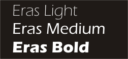
At Mitchelton Presbyterian Church, we used the Eras font family for a number of years. It's great, because it comes in a number of different weights, from Eras Light right through the range to Eras Black and Eras Ultra. We used Eras medium for body text, and picked out strong contrasts with Eras Ultra, or at times, with large headings in Eras Light.
After a few years, it was time for a makeover. Eras was starting to look a bit stodgy and dated. Again, the goal was to find a typeface that contained a broad family of different weights - not so easy if you're on a limited font budget. We settled on the Bell Gothic family. With clean modern lines, it looked fresh, and there's a nice contrast between the medium and black versions.

While - to be honest - I didn't like the Bell Gothic lettershapes as much as Eras, our publications had a clean, fresh look. We used Bell Gothic on our bulletin, Bell Gothic on our newsletters, Bell Gothic on our mail, Bell Gothic on our study guides... it was everywhere.
There's one more step in the process; but that's another story.
No comments:
Post a Comment