Mike Pittman offers the following handy links for stock photos:
http://www.yotophoto.com
This is a search engine for images that taps into several other free image banks. All are high resolution. All are free to use, although some require permission and/or attribution (licensing information is available for each photo).
I've got a plugin for my Firefox browser that allows me to search this site without opening the page first (http://yotophoto.com/plugin). There is quite possibly one available for internet explorer, but I haven't got the motivation to look for it
Something else impressive that Yotophoto does is search by colour - see http://yotophoto.com/search-by-color
http://www.pixelperfectdigital.com/
Many of these are taken on white backgrounds, meaning it is dead simple to remove the background.
Some other resources that may be useful;
http://www.picnik.com/
http://www.freewebpageheaders.com/
http://www.designpacks.com/ - by Darren Hester - pixelperfect, designsbydarren etc.
Showing posts with label Web. Show all posts
Showing posts with label Web. Show all posts
Thursday, April 05, 2007


Friday, March 02, 2007
Kuler Colours!
Stuck for a creative (and tasteful) colour combo? Kuler can help! WIth active colour discussion forums and an ever growing range of colour schemes, it's a great place for a dash of inspiration.


Tuesday, February 27, 2007
Two neat new free fonts
Free fonts are a dime a dozen - it's only rarely that you'll find a gem that's well enough designed for professional use. Here are two I've unearthed recently at www.dafont.com... they may even work quite well as partners, with Yanone as headline font and Fontin for body text.


Friday, February 02, 2007
Pic 2 Colour
Here's a handy online utility for automatically generating colour schemes from bitmap images... pic2color. Seems to work just fine...


Thursday, January 25, 2007
More tips for church websites...
These church web design tips come from http://ied.gospelcom.net/church-syndicate.php ... with permission. Solid gold!
CHURCH WEBSITE DESIGN TIPS
Your church site will be the first point of contact for many people in your community. First impressions count. It should therefore be at least as professional and attractive as your outside sign-board or newsletter. Extra
Do not place too much information on your homepage. It needs just sufficient graphics and text to explain at a glance who you are and what is available elsewhere on the site. The homepage should be a doorway, not a stopping point. It should not take the form of a welcome letter from the pastor – a website is not the same as a printed brochure.
And all important information should be ‘above the fold’. In other words, almost everything should be visible without needing to scroll. The homepage should not be much more than one screen in height.
Avoid ‘churchy’ graphics – open Bibles, stained glass windows, doves, candles. And appeals for money. These are off-putting to many non-Christians. There are even church sites out there using 1990s animated graphics: revolving golden crosses and doves with flapping wings.
Do not add automatically starting Midi hymn tunes or music files to your site either – these are very irritating. And finance, if it must be mentioned at all, should only be in areas clearly aimed at the members.
Use at least one graphic of a person’s face on the homepage. This tip is so important, it is in here twice! Churches are primarily about people, not buildings. A well-chosen picture can express far more than many words, and illuminate the meaning of your text.
A 3-column layout is often the most suitable for a church site. You can get ready-designed template coding for pages – already set up with headers, columns and footers to use in your own HTML editor. If you use the industry-standard Dreamweaver software for web design (and non-profits can buy this at a quarter of full price), it contains ready-made templates ideal for church sites. Do not skimp on design software, and read reviews before choosing. The alternative is a ready-made site – see #45.
Never use an introductory ‘splash page’. A ‘splash page’ is an introductory page containing nothing but a graphic (or even animated sequence) plus ‘click here to enter’ link. These are intensely irritating to users. Many people will leave the site, rather than clicking through. Splash pages can also reduce your ranking in search engines.
Every page should display the same overall appearance, with the same navigation options in the same place. Pages which lack consistent style will confuse users, who wonder if they have strayed onto a different site. A navigation menu should appear on all pages – don’t force people to go back through the homepage to find another page. Extra
All links, menu options and buttons should be clearly identified as ‘active’ – they should change color when hovered. Links and buttons, which do nothing when hovered, appear dead. People need these visual clues. Also think long and hard before introducing link styles that are not standard. A blue underlined link remains the ‘language’ that most people understand. (Don’t underline any text which is not a link – this is really confusing!)
If you use Javascript – a special hidden code written into a web-page, which can carry out functions within the page after it has downloaded – for any effects, ensure everything on the site still works for those with Javascript disabled. Make sure that words or links which only work with Javascript are actually made invisible (rather than just non-operational) in a Javascript-disabled browser. Provide alternative options enclosed within ‘noscript’ tags if necessary. 5-10% of web users have Javascript disabled. That is a lot of visitors to your website over a year. In fact, many Javascript tricks can be produced by other means, using CSS and PHP.
Don’t use frames – a page design with code which enables one or more blocks of content to be scrolled independently – for site design. Although there are a few specialized situations where frames can be used effectively, a standard church website is not one of them. They have a range of disadvantages, which even expert design cannot overcome.
Learn how to use ‘include’ files – a great time-saver. If you have not yet discovered the time-saving benefits of site-wide ‘include’ files (where a single file generates headers, footers, menus, etc. within a page) now is the time. Do a Google search for ‘server side includes’. Also learn how to use CSS. CSS (Style Sheets) is another essential site-wide method of setting page appearance and structure with a single file – see the ‘Extra’ link. Time spent learning ‘includes’ and CSS will repay a webmaster many times over. Extra
Use colors correctly: understand how to choose a color scheme, how colors relate to each other, and what mood they communicate. Ask a graphic designer for advice. Most of us do not have an eye for color. Clashing or inappropriate colors will negate the message of your site, and drive visitors away. Extra
Don’t use patterned graphic backgrounds behind body text. With very few exceptions, black body text on a white (or near-white) plain background is best.
Consider a ‘liquid’ page design: the content should flow naturally and fit together, at any screen resolution (i.e. size of the monitor screen measured in pixels) or reasonable font resize by a user. This is arguably better than making a fixed-width 800-pixel-wide page design. (A majority of people now use 1024 x 760 anyway.) The Internet Evangelism Day site, for instance, is completely liquid, even down to the old 640 x 480 screen resolution. And don’t put ‘best viewed at resolution’ or ‘best viewed in browser Y’ on your website. This is irritating to people who use a different resolution or browser. It is your job to make their viewing experience a positive one, whatever screen resolution, browser, or operating system they use. Don’t put a visible ‘visitor counter’ on your pages either.
Don’t include ‘mailto’ email addresses in plain coding on the site. They will be ‘harvested’ by spammers. Create a contact form instead. Or at the very least ‘obfuscate’ addresses using coding that hides them, with a heavy-duty Javascript encoding. (You can use multiple contact forms to direct mail to different church departments.)
Your site need not be large or complex. If you do not have the gifts or staff to maintain a large site, it is OK just to have an attractive single page, or a handful of informative pages. A group of churches in a locality could even build a combined co-operative website.
Don’t leave out-of-date content online. Few things rob a site of credibility more than this.
Use several people to proof-read for typos and poor grammar. Mistakes also rob a site of credibility in the eyes of many people. Proof-reading is best done on paper printouts, not on-screen.
Make your pages printer-friendly. This can be done automatically, using a ‘print’ CSS style-sheet. This page uses a print style-sheet derived from alistapart.com – follow the ‘Extra’ link. Extra
Take time to assess your target audience, their interests, needs and circumstances. Understanding your audience is essential to any form of communication. Use our worksheet planner to help you build up a clear picture of your potential site visitors: click on the Extra link. Extra ]
Not least, pray – both for planning and implementation. A church site has the potential to touch many needy people. We need the Lord’s wisdom for initial planning and strategy, and for ongoing effectiveness. It is a ministry that needs prayer.
CHURCH WEBSITE DESIGN TIPS
Your church site will be the first point of contact for many people in your community. First impressions count. It should therefore be at least as professional and attractive as your outside sign-board or newsletter. Extra
Do not place too much information on your homepage. It needs just sufficient graphics and text to explain at a glance who you are and what is available elsewhere on the site. The homepage should be a doorway, not a stopping point. It should not take the form of a welcome letter from the pastor – a website is not the same as a printed brochure.
And all important information should be ‘above the fold’. In other words, almost everything should be visible without needing to scroll. The homepage should not be much more than one screen in height.
Avoid ‘churchy’ graphics – open Bibles, stained glass windows, doves, candles. And appeals for money. These are off-putting to many non-Christians. There are even church sites out there using 1990s animated graphics: revolving golden crosses and doves with flapping wings.
Do not add automatically starting Midi hymn tunes or music files to your site either – these are very irritating. And finance, if it must be mentioned at all, should only be in areas clearly aimed at the members.
Use at least one graphic of a person’s face on the homepage. This tip is so important, it is in here twice! Churches are primarily about people, not buildings. A well-chosen picture can express far more than many words, and illuminate the meaning of your text.
A 3-column layout is often the most suitable for a church site. You can get ready-designed template coding for pages – already set up with headers, columns and footers to use in your own HTML editor. If you use the industry-standard Dreamweaver software for web design (and non-profits can buy this at a quarter of full price), it contains ready-made templates ideal for church sites. Do not skimp on design software, and read reviews before choosing. The alternative is a ready-made site – see #45.
Never use an introductory ‘splash page’. A ‘splash page’ is an introductory page containing nothing but a graphic (or even animated sequence) plus ‘click here to enter’ link. These are intensely irritating to users. Many people will leave the site, rather than clicking through. Splash pages can also reduce your ranking in search engines.
Every page should display the same overall appearance, with the same navigation options in the same place. Pages which lack consistent style will confuse users, who wonder if they have strayed onto a different site. A navigation menu should appear on all pages – don’t force people to go back through the homepage to find another page. Extra
All links, menu options and buttons should be clearly identified as ‘active’ – they should change color when hovered. Links and buttons, which do nothing when hovered, appear dead. People need these visual clues. Also think long and hard before introducing link styles that are not standard. A blue underlined link remains the ‘language’ that most people understand. (Don’t underline any text which is not a link – this is really confusing!)
If you use Javascript – a special hidden code written into a web-page, which can carry out functions within the page after it has downloaded – for any effects, ensure everything on the site still works for those with Javascript disabled. Make sure that words or links which only work with Javascript are actually made invisible (rather than just non-operational) in a Javascript-disabled browser. Provide alternative options enclosed within ‘noscript’ tags if necessary. 5-10% of web users have Javascript disabled. That is a lot of visitors to your website over a year. In fact, many Javascript tricks can be produced by other means, using CSS and PHP.
Don’t use frames – a page design with code which enables one or more blocks of content to be scrolled independently – for site design. Although there are a few specialized situations where frames can be used effectively, a standard church website is not one of them. They have a range of disadvantages, which even expert design cannot overcome.
Learn how to use ‘include’ files – a great time-saver. If you have not yet discovered the time-saving benefits of site-wide ‘include’ files (where a single file generates headers, footers, menus, etc. within a page) now is the time. Do a Google search for ‘server side includes’. Also learn how to use CSS. CSS (Style Sheets) is another essential site-wide method of setting page appearance and structure with a single file – see the ‘Extra’ link. Time spent learning ‘includes’ and CSS will repay a webmaster many times over. Extra
Use colors correctly: understand how to choose a color scheme, how colors relate to each other, and what mood they communicate. Ask a graphic designer for advice. Most of us do not have an eye for color. Clashing or inappropriate colors will negate the message of your site, and drive visitors away. Extra
Don’t use patterned graphic backgrounds behind body text. With very few exceptions, black body text on a white (or near-white) plain background is best.
Consider a ‘liquid’ page design: the content should flow naturally and fit together, at any screen resolution (i.e. size of the monitor screen measured in pixels) or reasonable font resize by a user. This is arguably better than making a fixed-width 800-pixel-wide page design. (A majority of people now use 1024 x 760 anyway.) The Internet Evangelism Day site, for instance, is completely liquid, even down to the old 640 x 480 screen resolution. And don’t put ‘best viewed at resolution’ or ‘best viewed in browser Y’ on your website. This is irritating to people who use a different resolution or browser. It is your job to make their viewing experience a positive one, whatever screen resolution, browser, or operating system they use. Don’t put a visible ‘visitor counter’ on your pages either.
Don’t include ‘mailto’ email addresses in plain coding on the site. They will be ‘harvested’ by spammers. Create a contact form instead. Or at the very least ‘obfuscate’ addresses using coding that hides them, with a heavy-duty Javascript encoding. (You can use multiple contact forms to direct mail to different church departments.)
Your site need not be large or complex. If you do not have the gifts or staff to maintain a large site, it is OK just to have an attractive single page, or a handful of informative pages. A group of churches in a locality could even build a combined co-operative website.
Don’t leave out-of-date content online. Few things rob a site of credibility more than this.
Use several people to proof-read for typos and poor grammar. Mistakes also rob a site of credibility in the eyes of many people. Proof-reading is best done on paper printouts, not on-screen.
Make your pages printer-friendly. This can be done automatically, using a ‘print’ CSS style-sheet. This page uses a print style-sheet derived from alistapart.com – follow the ‘Extra’ link. Extra
Take time to assess your target audience, their interests, needs and circumstances. Understanding your audience is essential to any form of communication. Use our worksheet planner to help you build up a clear picture of your potential site visitors: click on the Extra link. Extra ]
Not least, pray – both for planning and implementation. A church site has the potential to touch many needy people. We need the Lord’s wisdom for initial planning and strategy, and for ongoing effectiveness. It is a ministry that needs prayer.
Church Web Design Checklist
There's a useful design checklist for church websites here ... I haven't dared assess our church website yet, but I think we're doing okay with the site designed by Paul Harvey for our freshchurch plant. Along with graphic design issues, the checklist asks useful questions like" "Is there a purpose statement displayed on the homepage which, while perhaps good at motivating your members, could be off-putting to some non-Christians because it is all about ‘reaching others for Christ’? Or do other aspects of the site give the impression ‘We are out to convert you’, rather than ‘We are a family of flawed real people, please come and share the journey with us.’" If so, deduct 15 points... a penalty only exceded in magnitude by having a non-functional splash page at the front of your site (-20)
Friday, November 10, 2006
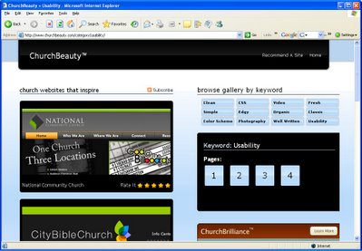
Beautiful Church Websites
Here's a site worth clicking - ChurchBeauty.com is a gallery of the best church website designs. Classifications include categories like "Well written", "Clean", "Simple" and "Edgy." Thanks to Martin Howard for the tip.

Saturday, November 04, 2006
Some favourite sites from a design pro...
Graphic designer Martin Howard from Media 7 offers a few favourite links:
Free stock photos
http://www.sxc.hu
Logo inpiration
http://www.misipile.com/
Progressive church web design....
http://www.kcrevolution.org/
http://www.dulleschurch.org/
http://www.discoverthecoast.com/
http://www.journeychurchnashville.com/
I'll add another church site to the list - www.latechurch.com, with design by Paul Harvey.
Free stock photos
http://www.sxc.hu
Logo inpiration
http://www.misipile.com/
Progressive church web design....
http://www.kcrevolution.org/
http://www.dulleschurch.org/
http://www.discoverthecoast.com/
http://www.journeychurchnashville.com/
I'll add another church site to the list - www.latechurch.com, with design by Paul Harvey.
Tuesday, October 31, 2006
CreateMinistry - from FEVA

Create_Ministry: "Today’s world is a world of mass communication. We know everything about everyone, and companies and organizations know everything about us. Despite this, it seems that the gospel of our Lord Jesus Christ has slipped off the radar. Create is a ministry that aims to put Christ back on the world agenda through the very modes of communication that clutter and shape our Christless world."
Make sure you take a look at the gallery link. Here's a sample:
Wednesday, October 18, 2006
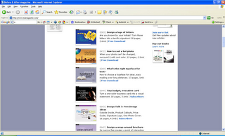
Another useful website - Before & After
Before & After magazine has been sharing its practical approach to graphic design since 1990. Dedicated to making graphic design understandable, useful and even fun for everyone, B&A specialises in makeovers. There's a pile of free stuff, but it's worth subscribing for the beautifully designed monthly features in pdf format. The cost: $US24 for 12 months.

Thursday, September 21, 2006
Subscribe to:
Posts (Atom)