Friday, September 22, 2006

Cool Makeover

Here's a great example of a design-makeover from Bryson Smith, Dubbo Presbyterian Church. The original looked like this:


Too many fonts, too many alignment lines... so what happens when you simplify and reduce them? Take a look.

Thursday, September 21, 2006

A useful website

Here's an interesting site... Church Marketing Sucks

Finding Inspiration

Here's a hot tip. If you want to avoid creating church publications with a cringe factor, avoid using church clip-art for inspiration. It's always going to be same-old-same-old; trite illustrations of all the usual stuff. Create cultural engagement by looking for inspiration in the kind of media people are exposed to every day.

Here's an example. Though I've only seen one episode, the logo for Bryan Brown's 'Two Twisted' series on channel 9 really caught my eye. It's sensational:


With a teaching weekend on "The Seven Deadly Sins" coming up, I figured that the topic had suitable 'dark edge' for a similar treatment. I experimented with a bit of amateur calligraphy of my own before settling on the font LMS Bloody Brujah on www.dafont.com. I added a few swishes and swirls, and ended up with something that I thought was sufficiently evil looking... so much so that I had to lighten the effect with a few "Seven Deadly Sins" Ice Creams from Streets. Comments and suggestions welcome:

Makeover 2 - Alignment

One of the four major design tips from Robin Williams (The Non Designers Design Book)is to watch your alignment. In simple terms, it means making sure things line up. When you set out text and shapes on a page, strong alignment-lines are inevitable - the edge of a box, the side of a text frame, or a strong line in an image all create linear elements that direct the eye. Too many of these, and the effect is confusing and untidy.

David Whitbread puts it this way: "One way to ease the resulting angst is to limit the number of implied lines and shapes by using the same ones many times, instead of creating new ones at each introduction of a new element. This strengthens the layout. The secret formula to succesful laout... is to limit the number of vertical and horizontal divisions of the space. Let the same line do a few jobs. It could be:
* the edge of the title block
* the border of a picture
* the centre of a logo at the bottom of a page.

Aligning elements effectively groups them together, and creates a single entity in your design. You'll need to be aware of how these visually grouped elements work with the other parts of your design in terms of balance and contrast.

In our makeover example, notice how many different "lines" there are on the page. How could you reduce them?

Makeover - Reduce the fonts!

Here's a church bulletin sheet I picked up recently. It's a useful starting point for a design makeover. First, count the number of different fonts that appear on the front page...


Try setting up a similar document in your own design software; start with mutliple fonts, and try to reduce it to a maximum of two contrasting faces.

Compatible Typefaces

Remember the rule? Too many fonts make your work look like a kid in a toybox. It's important in any publication to stick to no more than a couple of contrasting fonts. And in defining a corporate 'identity', our goal is to lock in one basic type family with multiple weights. Let's bend the rules just a fraction... designer David Whitbread says that some organisations choose a "support" typeface as well. It may add un-necessary complications, and needs care if you're going to handle it with success. The key is... contrast. For typefaces to work together well, they've got to be decidedly different. Here's Whitbread again (p185, The Design Manual):
"The secret of successful combination of typefaces seems to be the ability to maintain several contrasts between them. Look for at least two contrasts when selecting your 'worker' and 'special' faces. The stronger the contrast, the more effective the combination will be. You can contrast:
* their form: serif (like Times, with little tags on the stems), sans serif (like Arial, without tags), script or decorative
* their weight
* their scale
* their spacing (wide or narrow)
* their slant (Roman or italic)
* their shape (condensed or normal)
* their case (upper or lower)

Whatever you do, avoid using two different sans serif fonts on a page. For example, don't use both Eras and Arial - they look similar, but the small differences clash disasterously.

At MPC, it was time to supplement our "house style" with a contrasting "special" font. I found "Baby Bowser" at www.dafont.com ... and I think it works superbly with the Bell Gothic family. Leave your comments and tell me what you think.

Corporate Print Identity

If you're still not convinced it's worth giving your church publications a makeover, consider this quote from David Whitbread's Design Manual. "Print identity is only part of an organisations image - but it's probably the easiest part to control. Many organisations appear to not understand how their visual identity works for them, or in many cases, against them. The print identity affects not only outsiders' views of an organisation, but also insiders'. It can help the organisation establish a perception of itself as worthwhile, trustworthy, professional, forward thinking, up-to-date... alternatively, it can look fly-by-night, cheap, tasteless or muddled." Naturally, a print-identity makeover won't help a bit if your church really is fly-by-night, cheap, tasteless or muddled. But if you're looking for a way to symbolise the fact that your church is going forward with confidence - much to the current members as to newcomers - you could do worse than professionalise your print-identity.

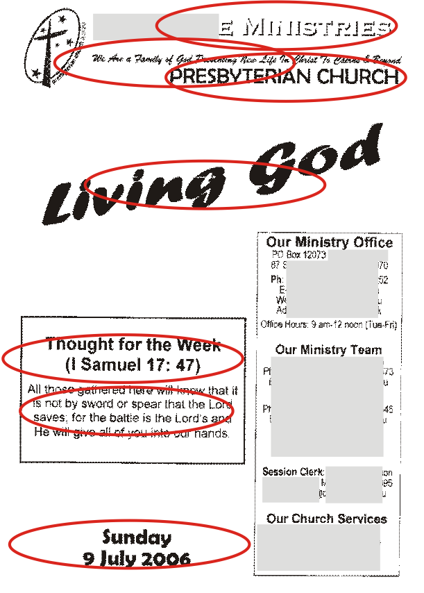
How? It's simple. Get rid of multiple fonts! Yeah, I know - fonts are fun. I love 'em. But the trick to professionalising your look is to limit your typeface selection to a maximum of two carefully selected fonts. Look around. Phone companies like Telstra and '3'have easily identifiable corporate fonts that appear in every ad. In some cases, the typeface is specially commisioned and designed. To change a corporate typestyle is no small decision - once a 'house style' is defined, it's applied rigorously.

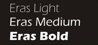
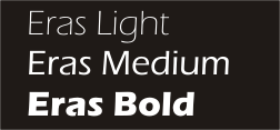
At Mitchelton Presbyterian Church, we used the Eras font family for a number of years. It's great, because it comes in a number of different weights, from Eras Light right through the range to Eras Black and Eras Ultra. We used Eras medium for body text, and picked out strong contrasts with Eras Ultra, or at times, with large headings in Eras Light.


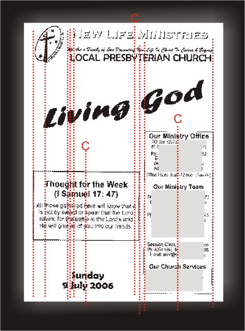
After a few years, it was time for a makeover. Eras was starting to look a bit stodgy and dated. Again, the goal was to find a typeface that contained a broad family of different weights - not so easy if you're on a limited font budget. We settled on the Bell Gothic family. With clean modern lines, it looked fresh, and there's a nice contrast between the medium and black versions.


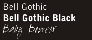
While - to be honest - I didn't like the Bell Gothic lettershapes as much as Eras, our publications had a clean, fresh look. We used Bell Gothic on our bulletin, Bell Gothic on our newsletters, Bell Gothic on our mail, Bell Gothic on our study guides... it was everywhere.

There's one more step in the process; but that's another story.


Two Good Books on Design

Looking for a simple guide to getting started with design? Simplest and best is "The Non Designer's Design Book," by Robin Williams at Peachpit Press. With just four simple rules, she can demolish and rebuild everything you've ever put on paper. The rules? Consistency, Repetition, Alignment and Proximity. I'm sure there's an easy acronym in there somewhere. More on these later.
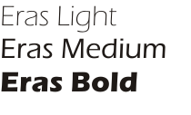
The second book worth checking out is a bit more substantial. Written by Australian David Whitbread, "The Design Manual" (UNSW PRESS) is a huge and very thorough manual written in an easily accessible style, and loaded with examples.

Appearance isn't everything...

Let's get it clear right from the start. Appearance isn't everything; beauty really is only skin deep. But that doesn't mean we should go out of our way to make church publications look intentionally ugly or amateurish. The cool thing is, when you do it yourself, a delicious design costs no more than a design disaster. Make the effort to learn some simple design rules, and your church publications will start to look as if they mean business. People will read them with the attention they deserve, and there will be a subtle change in the way your church is perceived. It's all about attention to detail; a statement that what you're doing and saying is worth doing and saying well.