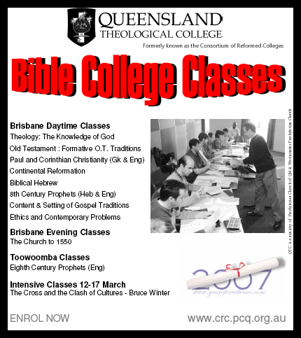
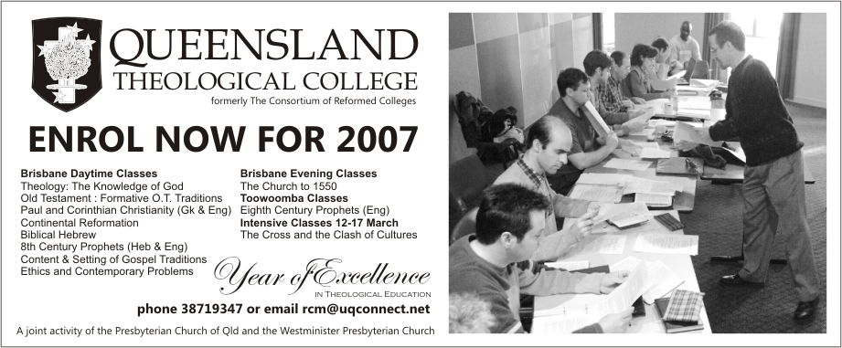
Here's a quick re-work of an ad trying to encourage people to enrol for college courses. The first was produced in Microsoft Publisher; the revised version in Corel Draw. A couple of observations; WordArt is almost never artistic. I think it's best completely avoided. Second, heavy black borders usually don't work too well either. Finally, the whole alignment issue again raises its ugly head. Any thoughts?
4 comments:
Huh? Where are the pictures? They appear when I click on the red crosses... so they're in there somewhere.
All fixed now.
Number 2 is much easier on the eye. Word art always says "cheap horror flick" . And with out a cool painting of a monster to go with it your ad content gets sucked into a graphical inversion vacuum.
Here's a funny story... at least I think it is.
I recently attended a conference in Brisbane that included a session on brochure design for the tourism industry from a printing company. The powerpoint slides accompanying the presentation featured heavy use of wordart, yellow font on a yellow background and broke a myriad of design rules. It wasn't intended to be ironic - if the people responsible for the printing of brochures can't get it right then who can...
I agree that word art should never ever be used in public. He did have some interesting points that I'll dig up and give to dad for this blog.
Post a Comment