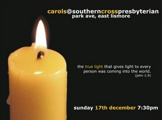
Meanwhile, Wade Iedema from Southern Cross Presbyterian Church in Lismore has come up with this neat postcard to advertise their upcoming Christmas event.

Sarah van Delden has been busy designing the flyer for ChristChurch... featuring their brand new logo.

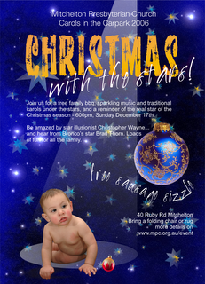
I'm feeling I've been left standing on the blocks with the design for our own "Christmas with the Stars" event. It's overly busy, and not quite working out the way I'd like. Any advice would be much appreciated.

4 comments:
I think you need to get rid of the baby - it spoils the vibe.
Trouble is, the baby IS the vibe. I guess that's the point of the design - who's the real star of Christmas?
PS would be good if anonymous posters could include at least a first name.
Actually, thinking more about it, what would you replace the baby with as the focal point? (I have never been quite happy with the actual baby I'm using - he's a pic from Dreamstime, and the best I could find. I experimented with a baby doll in a Santa hat, but that wasn't quite saying the right thing...)
Sorry to post anonymously - I was really just posting to see it worked.
I dont really rate myself as a designer so take all this with a grain of salt.
There's a lot of things to like about the design - particularly the colours/background etc. The thing is I didn't even notice the spotlight the first time. My eyes were draw to the Christmas ball and I was thinking, "What's with the baby?" But as you say, that is the point of the pic.
A few things I'd try:
* making the big ball smaller and adding lots of little ones - with the baby in the centre more...
* i'd try looking for a different baby, maybe even something which will more easily resonate with Christmas - perhaps a manger in the spotlight.
* could the baby be on a stage? to accentuate the spotlight idea? the baby image needs to look like it is being lit up by the spotlight.
In saying all that - its already very good, so dont be too discouraged.
wade
Post a Comment