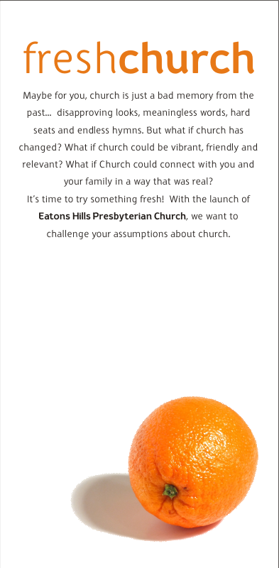
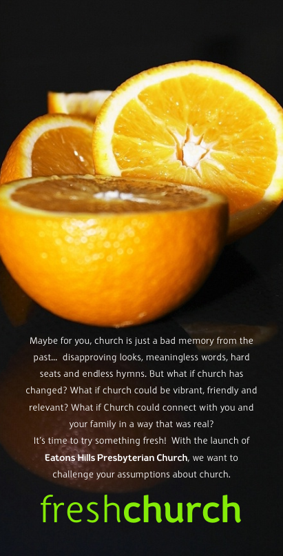
Still torn over whether to run with white or black for our Freshchurch ad campaign. (We're launching a new church at Eatons Hill on Brisbane's northside - these are for the letterbox drop.)
Your comments and preferences are welcome.
8 comments:
Anonymous
said...
I think the black is more masculine, I would go for the black. I reckon blokes are less likely to read the print, so they need attractive artwork.
White conveys integrity, sincerity, cleanness and honesty which seems to compliment the message of fresh. The black one looks great (like s sports car looks great) but I don't think it conveys the 'brand values' that people are seeking in a church ie authenticity, relationships, integrity etc.
I think both are sharp and do a great job. I think the art work and general design of the black one is better, BUT I personally prefer the white one for this job and what you're trying to communicate, see 'martin'. Black has worked well with stuff like black label wiskey, HSV Commodores etc. But I wouldn't be trying to link a fresh church with these image bases. Black is heavy, brooding etc. White is light and 'fresh.'
Let's get it clear right from the start. Beauty really is only skin deep. But that doesn't mean we should go out of our way to make church publications look intentionally ugly or amateurish. The cool thing is, when you do it yourself, a delicious design costs no more than a design disaster. It's all about attention to detail; a statement that what you're doing and saying is worth doing and saying well.
Followers
Best of Design4Church Tutorial - Click below to Download for $4.95
8 comments:
I think the black is more masculine, I would go for the black. I reckon blokes are less likely to read the print, so they need attractive artwork.
Love the white based one.... really FRESH and clean... good base for a good web 2.0 look
too.
Ideas are rushing through my head... awesome start there !!
White conveys integrity, sincerity, cleanness and honesty which seems to compliment the message of fresh. The black one looks great (like s sports car looks great) but I don't think it conveys the 'brand values' that people are seeking in a church ie authenticity, relationships, integrity etc.
black is the new black
I think both are sharp and do a great job. I think the art work and general design of the black one is better, BUT I personally prefer the white one for this job and what you're trying to communicate, see 'martin'. Black has worked well with stuff like black label wiskey, HSV Commodores etc. But I wouldn't be trying to link a fresh church with these image bases. Black is heavy, brooding etc. White is light and 'fresh.'
I know that this is a design blog, but I reckon the words are brilliant. Snappy, clear sentences with a terrific "challenge" at the end.
Just a warning though - your capitalisation of "church" is inconsistent.
(Would be nice if we could edit comments, rather than just delete them.)
We are running with the white. Thanks for the helpful comments.
Post a Comment