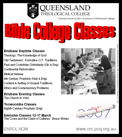
Here's a quick re-work of an ad trying to encourage people to enrol for college courses. The first was produced in Microsoft Publisher; the revised version in Corel Draw. A couple of observations; WordArt is almost never artistic. I think it's best completely avoided. Second, heavy black borders usually don't work too well either. Finally, the whole alignment issue again raises its ugly head. Any thoughts?