There's been debate among the ministry team at MPC about whether this web-poster is an engaging and attractive way to advertise a teaching weekend on "Forgiveness." It's masculine, it's dark, and it's based on the movie poster from Clint Eastwood's moody movie "Unforgiven." Personally, I figured it had a lot of advantages over a design featuring lots of flowers and girly stuff... but the jury is still out. Comments welcome.
Thursday, September 18, 2008
Selling Forgiveness
There's been debate among the ministry team at MPC about whether this web-poster is an engaging and attractive way to advertise a teaching weekend on "Forgiveness." It's masculine, it's dark, and it's based on the movie poster from Clint Eastwood's moody movie "Unforgiven." Personally, I figured it had a lot of advantages over a design featuring lots of flowers and girly stuff... but the jury is still out. Comments welcome.
Tuesday, September 16, 2008
How to make an A5 booklet
Ever wanted to make an a5 booklet using Open Office? Sure you have. Russell Williams explains how right here. Thanks Russ!
Saturday, September 13, 2008
Genuine Imitation
If you're looking for a free photoshop clone, read the Lifehacker review here. Otherwise, head straight over the the Artweaver site and download a copy right away. According to Lifehacker, "While it isn't a true replacement for Photoshop, Artweaver's feature set is robust; it includes layer management, image cloning, a history function, transparency, pen tablet support, and a host of the common filters in Photoshop."
Tuesday, September 09, 2008
Design Tips for Text
Take a look at a series of neat design tips for documents that are made up of large slabs of text here. In summary...
Top 10 tips for getting lively:
1. Make a shape
2. Supersize it
3. Create a time and place
4. Amaze with initials
5. Make your own alphabet
6. Have some pun to make your point
7. Do the unexpected
8. Make white space your friend
9. Use both sets of letters
10. Play with punctuation
2. Supersize it
3. Create a time and place
4. Amaze with initials
5. Make your own alphabet
6. Have some pun to make your point
7. Do the unexpected
8. Make white space your friend
9. Use both sets of letters
10. Play with punctuation
Friday, July 11, 2008
Multicolr Search Lab Sorts Flickr Pictures by Colour | Lifehacker Australia

Lifehacker Australia usefully reports that "Multicolr Search Lab Sorts Flickr Pictures by Colour.
Need an image with dark blue and green undertones for desktop wallpaper or a design project? Multicolr Search Lab, a free search utility, digs through roughly 3 million images in Flickr's 'Interesting' set for photos featuring the colours you select. You can make one colour more prominent by selecting it multiple times, and the results seem pretty genuine—though you have to find the colours with your eyes, and can't put in hexadecimal or RGB values grabbed from graphics programs. The colour search engine also has a front end for Alamy Stock Photography for those in need of definite royalty-free images."
Tuesday, June 24, 2008
I Am Red, Hear Me Roar - Chris Dickman
Ever wondered how you'd add new zing to the age-old Coca Cola branding? Take a look at I Am Red, Hear Me Roar - Chris Dickman for some inspiration!
Saturday, June 21, 2008
Presentation Masterclass
Friday, June 20, 2008
Annual Australasian Christian Conference

The AACC is a brand new academic conference for 'the academy and the church.' Time for a look at some first attempts at designing a suitable logo and brand identity. The conference organisers called for a Corinthian column and a cross to be integrated in the design, which should also feature the conference initials. Anyone else think upper-case "A" is hard to work with?
Cambridge University Style Guide
Cambridge University has their corporate design style guide online here. It's a wonderful example of how it should be done - typography, colours and other corporate identity markers are set out clearly, with a nice combination of flexibility and rigour. You can do absolutely whatever you like... as long as it's within the guidelines.
Wednesday, May 21, 2008
Vectors Explained by Mike Pittman
You don't have to go far on this site to hear about 'vector' graphics - but what are they? Well, 'vector' graphics are made of smooth curves, as opposed to the dots or pixels that make up 'bitmap' graphics. A bitmap image will get chunky or 'pixelated' when you enlarge it, but the curves in a vector image will stay smooth.A few articles back, Phil talked about making vector images by tracing a bitmap, but you can also get lots of free vector images online. A great source of public domain vector images is Open Clip Art Library, or Clker.com, which hosts many of the Open Clip Art images, but with a friendlier interface. Images on both these sites are are public domain, so there are no copyright hassles and you can do whatever you like with them.
The format they use is called SVG, which stands for Scalable Vector Graphics. SVG files open in Adobe Illustrator, Corel Draw or the free Inkscape. They are also quite easy to modify, because the bits kind of float over the top of each other. So, for instance, click on the text on the soft drink bottle, hit delete, and type something different. Click on the lime colour and change it to strawberry red in one more click. It's easy!

To learn more about vector editing, check out some great video tutorials by Heathenx (don't be turned off by the name). The videos on his home page can be large (~40Mb), but thankfully much smaller versions are up on YouTube here. Heathenx's videos are specific to Inkscape, but the principles transfer to any vector package.
So, watch some videos, have a bit of a muck around, and you'll soon get the hang of it. Remember to save your work, and there's always the undo button if you make a mistake. Mike Pittman, Tuggeranong Presbyterian Church
Thursday, April 17, 2008
The Challenge of Atheism
A Neat technique
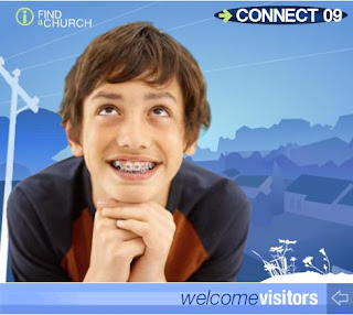
"I noticed this on the Anglican website advertising connect 09," says Stuart Atkinson. "I don’t really know how it’s done but I really like the effect."Agreed. Well done to Anglican Media's design department. (Sarah, is that you?) Clearly, it's a combination of vector and bitmap artwork, and there's an easy way to get something of the same effect... though not with the neat graduated colours that add depth to the CONNECT 09 piece.
If you want to try an easy simulation though, you can use Corel Draw's image cutout and autotrace functions.
I'm using Corel 14, which although s-l-o-w compared with version 12, offers greatly improved trace features.
Step 1 - Import a photo. The selection of your original photo image will determine the quality of the outcome. The simplicity and colour range of your background will be especially important. This one is a little too complex... but let's run with it.
Step 2 - Choose 'Edit Bitmap' to export the image to Corel Photo Paint. Use the ImageCutout Lab feature to trace around the girl in the foreground. Meanwhile, in Corel Draw, autotrace the original image with settings for low resolution Line Art. You want the resulting image to be as simple as possible.
Step 3 - Assemble
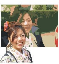
Paste the cutout image of the girl exactly on top of her vectorised representation. You've now got a bitmap foreground overlaid on a simple vectorised background.

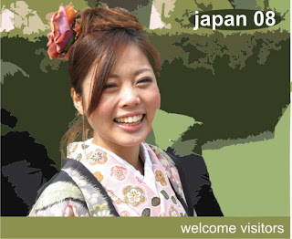
Step 4. Here's the result. I simplified the vector background a little by taking out the background people and extending the areas of green.Step 5. Finishing Touches - Add some text and compare it with the original image at the top of this post. It's a similar effect, but was completed in minutes...
Saturday, February 02, 2008
A Beautiful Powerpoint

Garnet Swann from Eatons Hill's Freshchurch is celebrating the first birthday of the church with a powerpoint presentation on why they want to "grow committed, connected, clear-thinking and compassionate followers of Jesus." It's not only a great framework for a church - it's one of the cleanest, most beautifully designed powerpoints I've seen for a while. Here are some pointers:
* Lots of clean white space
* crisp cut-out images on the white background look fresh, and integrate the design
* orange and grey make a great colour combination, and work well with the crisp black and white of the rest of the design
* the grey 08 background is another simple and clean design element. It's a simple, constant reminder that they're launching a new year, and adds a nice dynamic touch with the slight tilt, and the edge cropping.
* overall, it's simple, clean, and not too fussy.
Top marks!
Friday, November 02, 2007
Absolutely Magic Vectorising...
If you're looking for a way to convert dodgy bitmaps into smooth, smooth vector images - and who isn't? - go to http://vectormagic.stanford.edu/. In a word, it's fantastic. If you're familiar with tools like CorelTrace, you'll be astounded by the superior results. And it's free. Upload your bitmap, wait a few moments, and the SVG or EPS version of your image is ready to save back to your PC. Cool, cool, cool.
Truly... this is astonishingly cool.
Monday, July 23, 2007
Mark Bookmark
Friday, July 20, 2007
No ordinary flyer...
Bryson Smith has been working on the design for a flyer promoting the Western Plains Christian Convention, which is running under the title "The Life Less Ordinary." He's come up with a beautiful design, though he says he couldn't find exactly the stock image he was looking for..."The grain works because of the region," says Bryson from the heart of rural Australia... "but the flower is still less blokey than I'd like. I'd love a crowd scene in which everyone is frowning and one person is smiling or something like it." Even so, it's a great job, and one that we hope draws a crowd...
Friday, June 22, 2007
Two New Books from Amazon
I've just received my copies of two nice design books - ordered from Amazon.com to take advantage of the current great exchange rate. The first is 'Before & After Page Design' by John McWade - the same guy who does the B&A website and the magazine. Loads of inspiration and step by step tutorials. The second is 'Robin Williams Design Workshop - 2nd Edition.' Robin is the lady behind the 'Non-Designers Guide' which started me on the road to better design. This is a far bigger book, with far more examples - but maybe lacking the distilled clarity of the original. Even so, I've already pickup up some practical design ideas from each book.
Church4Kids
Back blogging after a long break - sorry about that. Here's the draft of a flyer I've been working on, which will be re-used around a number of churches in Brisbane in the next few months. The toughest challenge was finding the right kid-shot to liven it up. Ultimately, dreamstime.com came to the rescue once again... though they've recently both increased the cost of download credits, AND increased the number of credits per image. These kids cost 2 credits, or around $US4. Hope they do the job!
Thursday, May 24, 2007
MPC Website now LIVE!
Thanks to those who commented on the new-look MPC website. We are now live with a slight redesign at www.mpc.org.au - please drop by and check it out. Sorry Martin - the greyscale photos stay! They're a 'design feature...'
Saturday, May 12, 2007
Sneak Peak at New MPC Website

After almost 8 years without a makeover, the Mitchelton Presbyterian Church website was looking dated and tired. Time for a nip and tuck - with Dr Derek Hanna to the rescue. Weilding only a scalpel and a set of handy WordPress tools, Derek has sliced and diced to the point where the old site is barely recognisable. There's news, there are pics, and there are clear links (we hope) to our popular archive of talks and studies. We're still very much in beta, and still adding content and populating pages... but thought you might like to take a look and give your comments while there's still time to change things. Please take a look at http://www.mpc.org.au/new and tell us what you think.
Subscribe to:
Posts (Atom)


