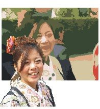
 "I noticed this on the Anglican website advertising connect 09," says Stuart Atkinson. "I don’t really know how it’s done but I really like the effect."
Agreed. Well done to Anglican Media's design department. (Sarah, is that you?) Clearly, it's a combination of vector and bitmap artwork, and there's an easy way to get something of the same effect... though not with the neat graduated colours that add depth to the CONNECT 09 piece.
If you want to try an easy simulation though, you can use Corel Draw's image cutout and autotrace functions.
I'm using Corel 14, which although s-l-o-w compared with version 12, offers greatly improved trace features.
Step 1 - Import a photo. The selection of your original photo image will determine the quality of the outcome. The simplicity and colour range of your background will be especially important. This one is a little too complex... but let's run with it.
Step 2 - Choose 'Edit Bitmap' to export the image to Corel Photo Paint. Use the ImageCutout Lab feature to trace around the girl in the foreground. Meanwhile, in Corel Draw, autotrace the original image with settings for low resolution Line Art. You want the resulting image to be as simple as possible.
Step 3 - Assemble

Paste the cutout image of the girl exactly on top of her vectorised representation. You've now got a bitmap foreground overlaid on a simple vectorised background.
 Step 4. Here's the result. I simplified the vector background a little by taking out the background people and extending the areas of green.
Step 5. Finishing Touches - Add some text and compare it with the original image at the top of this post. It's a similar effect, but was completed in minutes...


No comments:
Post a Comment