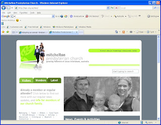
After almost 8 years without a makeover, the Mitchelton Presbyterian Church website was looking dated and tired. Time for a nip and tuck - with Dr Derek Hanna to the rescue. Weilding only a scalpel and a set of handy WordPress tools, Derek has sliced and diced to the point where the old site is barely recognisable. There's news, there are pics, and there are clear links (we hope) to our popular archive of talks and studies. We're still very much in beta, and still adding content and populating pages... but thought you might like to take a look and give your comments while there's still time to change things. Please take a look at http://www.mpc.org.au/new and tell us what you think.
4 comments:
good stuff. great design. sweet improvement.
Comments:
Nice and fresh colour (green is my fave colour online).
People images make it personal and warm.
It’s an easy on the eye site, though I think colour wise it could be enhanced if the rest of the page continued the theme of green (though perhaps in varying shades of light patters). To my memory there was green at the top banner, and then a lighter coloured background (was it white?) further down on the page. I just think consistency would work best. EG see how http://www.marshillchurch.org/ uses the white theme through the whole site, or likewise Will’s church Newlife with shades of green.
Navigation to my mind could be thought about a little more (Its not a huge issue but I think it can be made more user friendly with use of both consistency throughout the site, as well as the use of several ways to get to things from each page, which caters for the different ways people think and navigate online). It took me a moment to work out how to navigate. I went for the tabs on the left before realizing you go to the drop down doodads on the right top (I wanted to see a picture of the Big Kahoona so I tried the staff page).
On the staff page (or one of the other pages further into the site) the tabs on the left now appeared as folders on the left of the page with sub folders under them, (looking like how they appear on my Microsoft applications), and this was a different look to what had been on the front page of the site. I don’t know if this was a design idea or that technical issue you mentioned in your email, but I would stay clear of the folders/subfolders them, and move more towards buttons/links/tabs, as that appeals more to the arts/intuitive side of the brain which is what most people use when navigating online.
I hope you don’t mind me writing as I have.
MPC was due for an update (mind you, so is CRPC) and this is a great step forward.
Anyway, personally, I still think the late church section of the site is the best. The reason I like it is its clean lines, and urban colour scheme.
Every blessing,
Jens
looks very good,
wade
Much improved Phil.
Clean and fresh. Nice typography. I would tint the grey photo... either blue or a shade of one of the greens you use. I couldn't see any of the live pages, but keep that airy feel throughout the rest of the site and you'll have a winner.
Post a Comment