Ever wondered how you'd add new zing to the age-old Coca Cola branding? Take a look at I Am Red, Hear Me Roar - Chris Dickman for some inspiration!
Tuesday, June 24, 2008
Saturday, June 21, 2008
Presentation Masterclass
 Apple's Steve Jobs is the acknowledged master of dynamic presentations. Read how he does it here. Likewise, the designer of Al Gore's "Inconvenient Truth" presentation - the basis of his world-challenging movie - shares tips and techniques here. Thanks to Lifehacker.com for the links. Finally, Slideshare.net is a new site that's 'like youtube for presentations.' It's a great way to share your presentations with a remote audience, or to learn from popular examples.
Friday, June 20, 2008
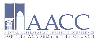
Annual Australasian Christian Conference

The AACC is a brand new academic conference for 'the academy and the church.' Time for a look at some first attempts at designing a suitable logo and brand identity. The conference organisers called for a Corinthian column and a cross to be integrated in the design, which should also feature the conference initials. Anyone else think upper-case "A" is hard to work with?
Cambridge University Style Guide
Cambridge University has their corporate design style guide online here. It's a wonderful example of how it should be done - typography, colours and other corporate identity markers are set out clearly, with a nice combination of flexibility and rigour. You can do absolutely whatever you like... as long as it's within the guidelines.
Subscribe to:
Comments (Atom)
